5 UX Tips for Designing More Usable Registration Forms
The web is crowded with UI solutions that we’ve inherited from the past, but are still applied because “everybody else does.” It is time to reconsider all of them, but especially registration forms. When designing registration forms, keep in mind that they are for the user and the smoother the registration process, the more delighted your customers will be.
Here are some tips to make the most of registration forms.
With Postcards you can create and edit email templates online without any coding skills! Includes more than 100 components to help you create custom emails templates faster than ever before. Try now for free!
Learn MoreOther ProductsDon’t make the user fill in the same field twice
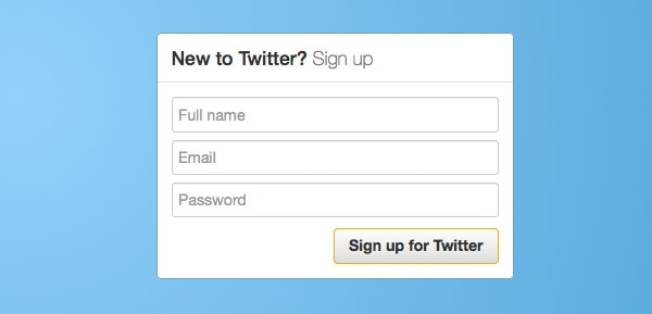
Almost everyone has gone through this – a registration form that requires you to type an email or password twice. Historically, this was designed to prevent mistyping errors. Have you ever typed your email or password wrong during registration process? Have you ever NOT copy-pasted the necessary field whenever the webpage allowed?
Well, even if there is a typo in the registration form the user can still recover using email. The user may spend extra time recovering his or her account, but it’s definitely not a big deal as opposed to the time we will save for hundreds of users who fill in the form correctly.
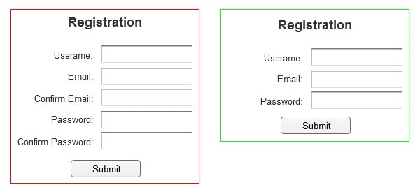
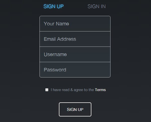
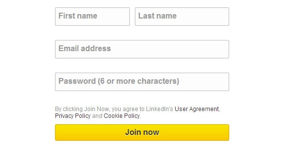
Here are a few forms that that are spot-on.
With Slides, we don’t make you start from an empty slate. All you have to do is to pick the elements you like best and combine them. Each slide has been carefully crafted to satisfy three key criteria: aesthetic, function and usability. That way you know every element works together seamlessly while enhancing the impact of your content.
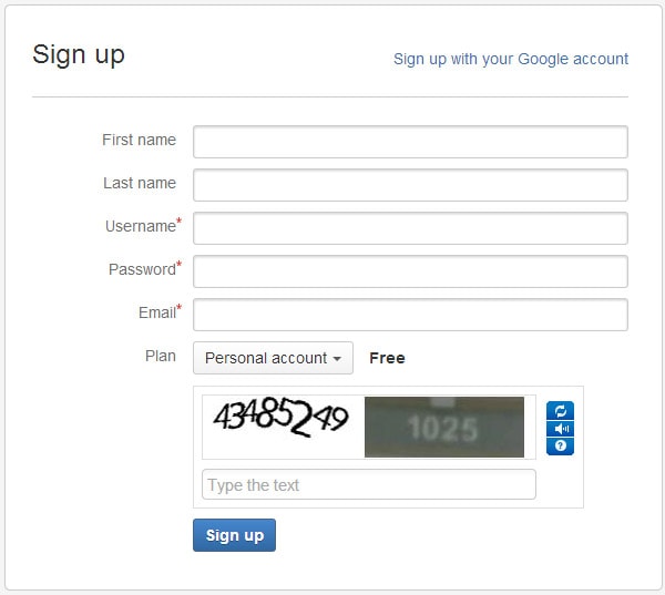
Create a WebsiteHighlight required fields
From a user experience perspective, it is better to have no optional fields, assuming that if a piece of information is not required there’s no point in wasting a user’s time. But for many companies marketing and acquiring customer data is crucial for business success.
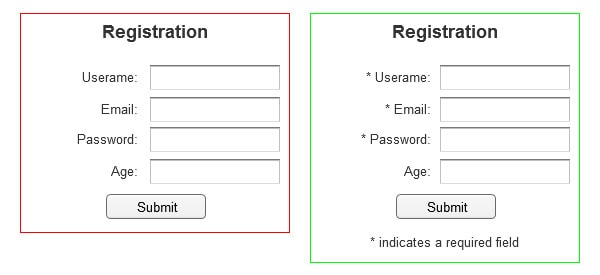
If there are optional fields in a registration form, make sure to clearly highlight required fields. Usually a small mark like an asterisk (*) is enough. It can be frustrating for users to find out that they have not filled in a required field after submission.
Look at how these websites solve this problem.
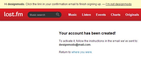
Don’t make users confirm via email before using the service
In order to start using most digital products and services we are often required to confirm an account via link sent by email. Why? How does my email contribute to delivering the service? These are questions that may not enter the minds of users, but they should bother YOU as a UX designer.

Why not let the user look around the site upon registration? If some features really need to use email, disable those and design a simple reminder for the user to confirm an email address later. It is better to deliver a limited working service immediately than nothing at all. This will help create a good first impression.
By requiring email confirmation, you are forcing a new user to leave your website, which may cause some traffic loss.
Keep users signed in when they register
Another common issue with registration UX is requiring users to sign in immediately after registration. The same problem occurs with many email confirmation links.
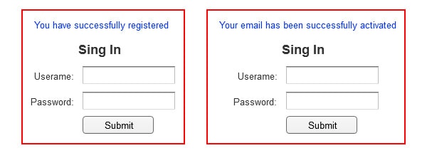
Is this for security purposes? Users commonly write down passwords only to forget them later and recover by email. In many instances, this extra step only frustrates the user.
Design the UX so that new users stay signed in immediately after registration, making the overall user experience smoother.
Nothing personal, but this is what you want to avoid.
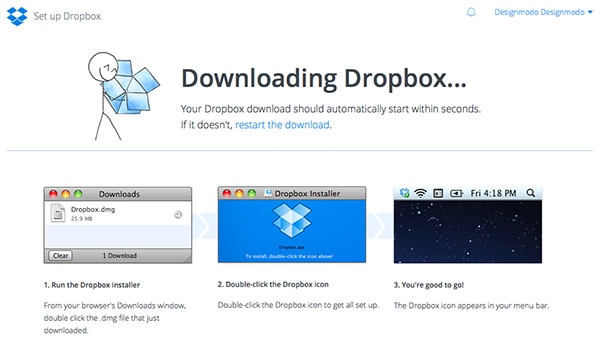
Dropbox does a great job with its registration process. After creating an account, you are redirected to Dropbox’s installation assistant.
Provide guidance, but don’t push
“For security reasons your password must be longer than 8 and shorter than 12 characters, contain at least one capital letter, a number and a symbol.” This is a typical password requirement, but the length of the password doesn’t guarantee security. A five symbol password can be as strong as A#c2d, while an eight symbol one can be as simple as just a “password.” Demanding users to consider all of the field requirements and think of a new and memorable password isn’t how a host would welcome a guest, right?
Show users the proper input format to save time and reduce guesswork.
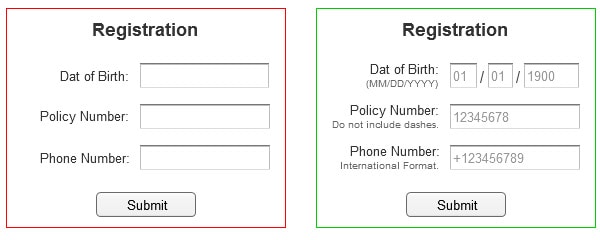
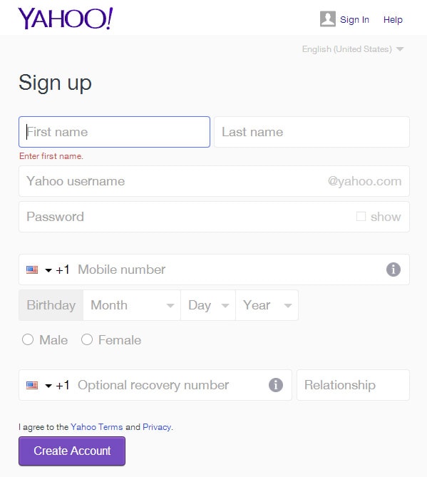
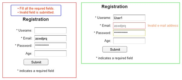
Go the extra step by providing more user-friendly and descriptive error messages as well. Notifications like “You must fill out all of the required fields” are not helpful when users don’t know exactly which field was incorrect.
A great solution for this problem is real-time data validation. This alerts users to mistakes right away and if performed on the client-side can even reduce the amount of work for your servers.
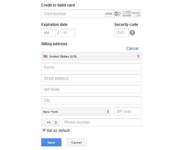
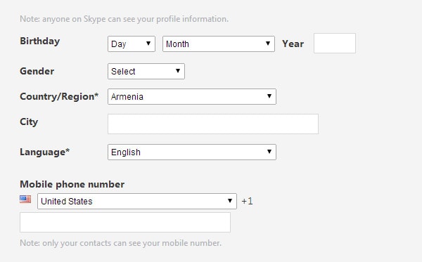
Google does a great job of this when adding a credit card to Google Wallet, as does Skype.
