Coming and Going Web Design Trends for 2014
Over the last couple of years we saw such a change in web design that it is unbelievable to anticipate what could possibly the next hot things. However, I have a few hunches of my own as to what trends will flourish this year and which ones will fade off. Let’s see if you would agree with me!
(Here are Reflections on Web Design Trends in 2013).
With Postcards you can create and edit email templates online without any coding skills! Includes more than 100 components to help you create custom emails templates faster than ever before. Try now for free!
Learn MoreOther ProductsTrends that are coming
There are a few trends that are up and coming – per say – that I am actually excited about. This year the design scene will be very interesting to watch as I think there will be a bunch of changes going on making for some exciting new trends actually.
Blurred backgrounds
Thanks to the release of iOS 7 last summer, designers have been using it as a source of inspiration like crazy. One very cool trend to come out of this is the increase use of blurred backgrounds. The idea is that the interface you are currently on is overlaying the previous one, think frosted shower doors, which is why the backgrounds are blurred. It is actually a pretty cool trend as a lot of these backgrounds create pretty great looking nonlinear gradients.
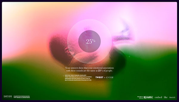
Emotions of sound
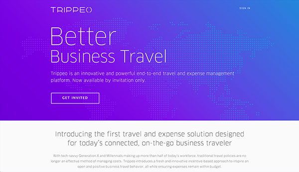
Trippeo
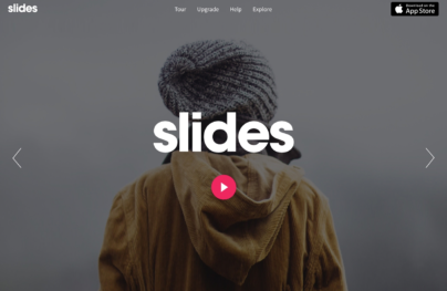
With Slides, we don’t make you start from an empty slate. All you have to do is to pick the elements you like best and combine them. Each slide has been carefully crafted to satisfy three key criteria: aesthetic, function and usability. That way you know every element works together seamlessly while enhancing the impact of your content.
Create a WebsiteSimple animations
The one other trend that seemed to take off after iOS7 is simple animations. You see this all over websites and apps; they are subtle animations that give affordance and personality to the design. You see it in gestures, like when you move up and down the chat bubbles in Messages where the bubbles bump against one another. You also see it on click events like when you click on the navigation and instead if just bluntly appearing, it transitions to roll down. A lot of this is made possible to the widespread use of CSS animations and transitions.
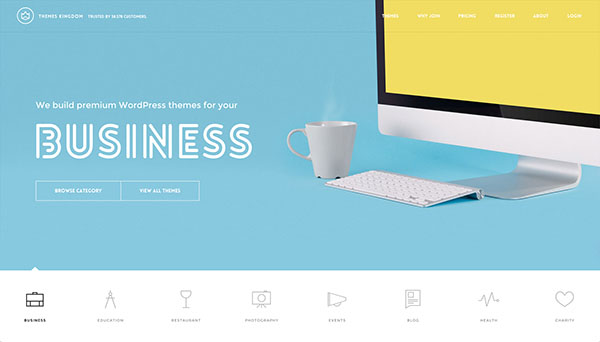
Theme kingdom
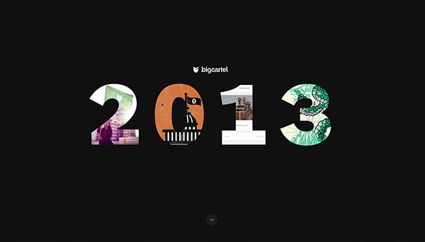
Big Cartel
Simple colours
Over the last year, bold and bright colors have been making a name for themselves. However, so have light and subtle color combinations that use a very light color pallets. Basically, I want you think Google when I talk about this trend. A lot of their UI use light grays and subtle sprinkle of color all over making the websites seem light and clean.
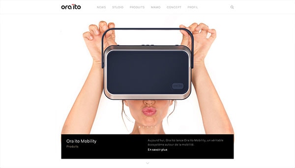
Ora ito
Better UX
What has been happening for a while now is increased improvement of user experience in websites. I think this will only escalade. There has been a big movement of combining user experience with business strategy in order to provide for better overall experiences on websites and apps. This is actually a quite brilliant and a smart move on any business’ part, granted that those two go together hand in hand.
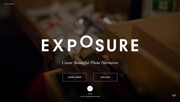
Exposure
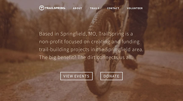
Trail spring
More scrolling less clicking
Researchers have noticed is the increased preference of users to scroll rather then click (http://olivianbreda.com/click-to-scroll/). That would explain why single page websites or even just long pages have been so successful. When you combine storytelling with user experience it often gets you a long page narrative. I think that websites will keep on experimenting with that more and more. I do not mean is that these pages will only scroll on and on to the bottom of the internet; I think websites will experiment with scrolling before dividing them up into individual pages.
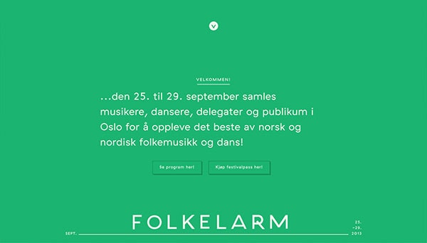
Folkelarm
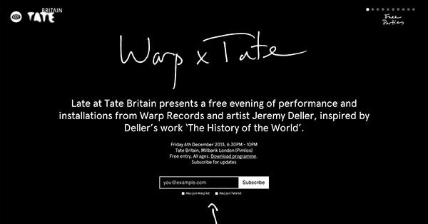
Wrap x tale
Big type
Typography has been getting a lot of attention on the web too. With the rising support of SVG icon fonts, those too have been becoming more and more popular. When I think of typography on the web, I think of big, big typefaces integrated into design. They are sleek, bold and beautiful; but there is more to that. Icon fonts are currently being revolutionized by the awesome guys from Iconic who are trying to make icons responsive.
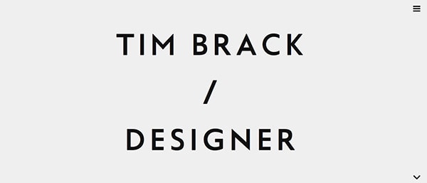
Time Brack
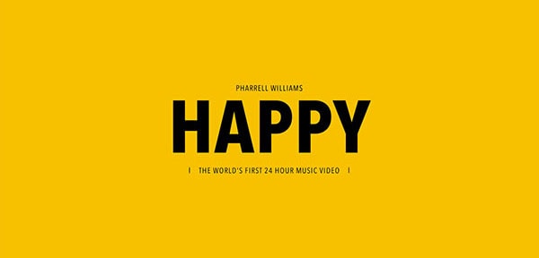
Happy
Personal content
People do not like impersonal, especially on the web. They do not like the idea of dealing with another machine especially when it is another business. Therefore, you see start ups who put out content on their website that is personable, where they come off as an actual human being behind the company. Content is king, and it is the only way for you to connect to your audience online. You’ve got to make it personal. Make your copy and images friendly, cheeky or eccentric; this way you can let your customers connect with you.
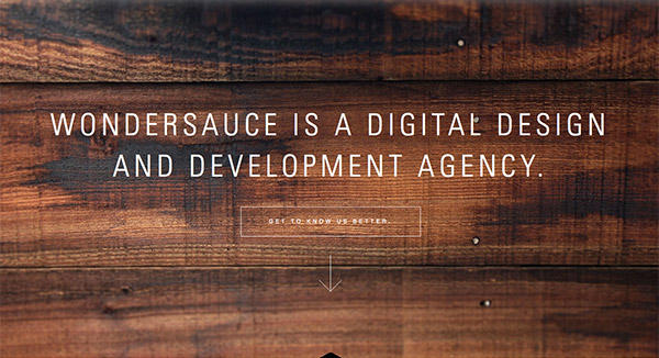
Wondersuance
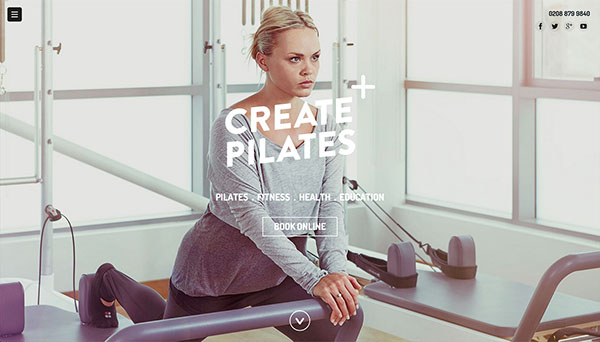
Create pilates
Bad
On the other hand there are a few things that we will be seeing less and less of this year. It’s awesome to see design and industry trends progress actually. Don’t you think? Either way, you shouldn’t be too upset by this actually.
Poor quality photography and videos
As a designer, stock photography is always a bad idea. However, have you noticed over the last year or two that in general the quality of photos has increased? It is definitely linked to the bigger use of pictures as design elements like blown up full width and height intro headers. It’s so pleasing to think that poor quality images are slowly making their way out. The industry puts the bar very high for photo quality – as it should – because photos are part of content too where quality makes or breaks the design and company branding. I think it goes with out saying that video quality is implied throughout this statement.
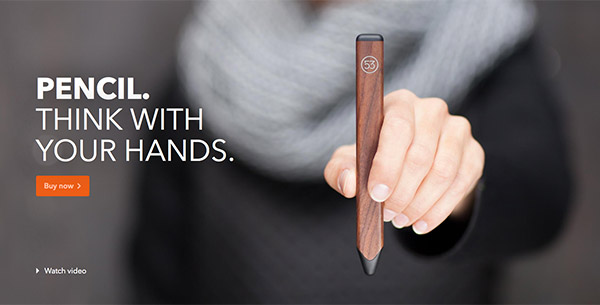
FiftyThree Pencil
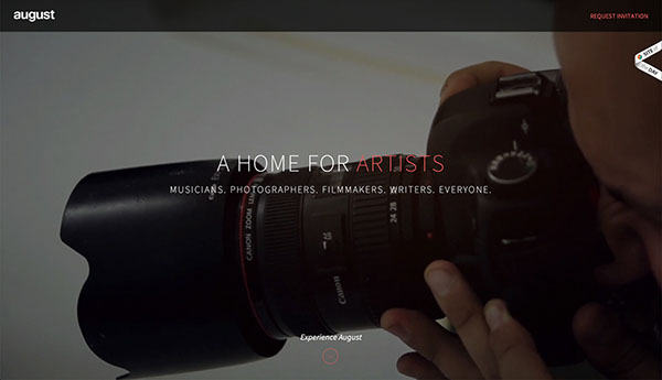
Agst
Flat and skeuomorphism
The flat vs skeuomorphism design debate is slowly thinning out. I strongly believe that the two extremes are going to become obsolete and we will be seeing more interfaces that meet in the middle with subtle gradients and flattering shadows instead. I think the fan boys of both, flat and skeuomorphism, will have to suck it up; those are just trends and they are both coming to an end. Let’s make room for a sort of compromise between the two, if you will.
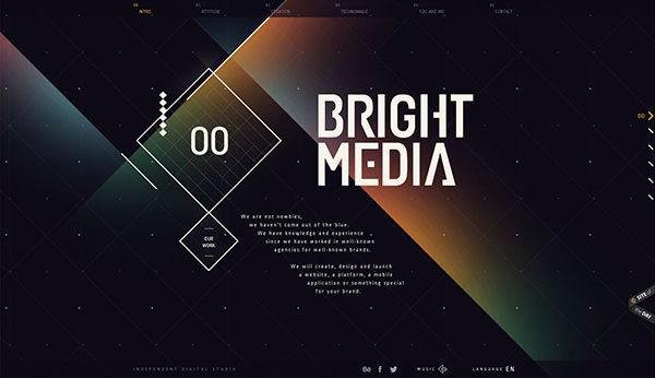
Bright Media
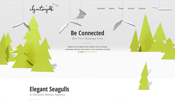
Elegant Seagulls
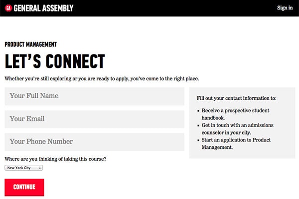
Extended forms
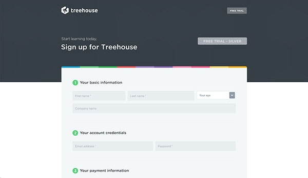
With the rise of minimalism and simplicity, I have noticed that forms are getting easier to fill out. This is because companies are finally listening to user researcher when they say people do not in fact like to fill out forms online. The bigger and longer the form, the least likely they are to be successfully filled out. How often have you seen forms where you don’t have to confirm your email or password in a duplicative? Whatever the amount, you’ll be seeing more of those and less of the clunky and obnoxious forms that ask for every detail of your life and your first born child just to sign up for a free email.
Treehouse
General Assembly