10 Tips for Designing with Type on a Photo
One of the best techniques to have in your toolkit is designing with type on and around images. But it can also be one of the toughest concepts to pull off successfully.
You have to have the right photo, a good eye for typography and know what you want to accomplish to make the most of adding type to an image. If you feel like you are ready to take on the challenge, here are 10 tips for making it work:
With Postcards you can create and edit email templates online without any coding skills! Includes more than 100 components to help you create custom emails templates faster than ever before. Try now for free!
Learn MoreOther Products1. Add Contrast
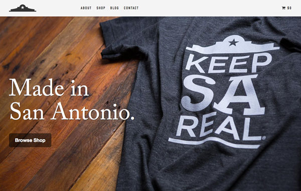
Text has to be readable to be successful. Make sure that text varies in color enough to be seen in combination with the photo. If you have a photo with a dark background, opt for white (or light colored) text. If your photo has a light background, go with a dark-colored type treatment.
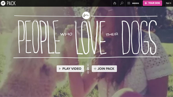
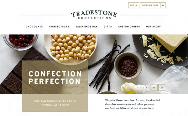
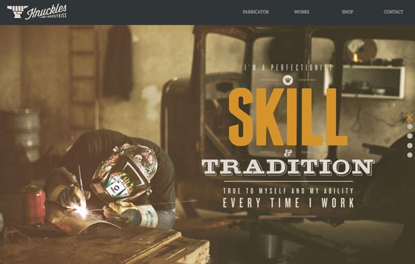
Contrast can also refer to the size of text in relationship to what is happening in the image. Lettering should work with (not against) the image. In the Pack website above, for example, the image is big and bold while the type is thin and light. The elements work together but they contain and element of contrast.
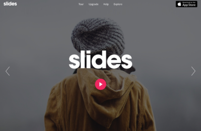
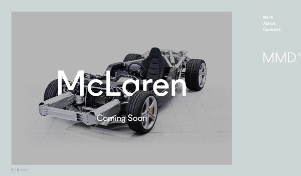
2. Make Text Part of the Image

With Slides, we don’t make you start from an empty slate. All you have to do is to pick the elements you like best and combine them. Each slide has been carefully crafted to satisfy three key criteria: aesthetic, function and usability. That way you know every element works together seamlessly while enhancing the impact of your content.
Create a WebsiteSometimes it just works that text becomes – or is – part of the image you are working with. This can be tough to achieve and only works in limited cases. You either need a simple image and word to work with, such as the McLaren treatment above, or an image that is taken with text in it.
3. Follow the Visual Flow
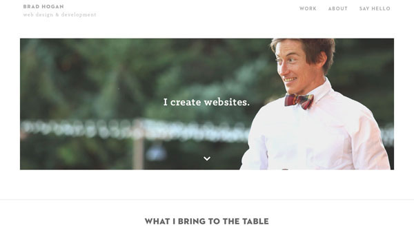

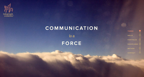
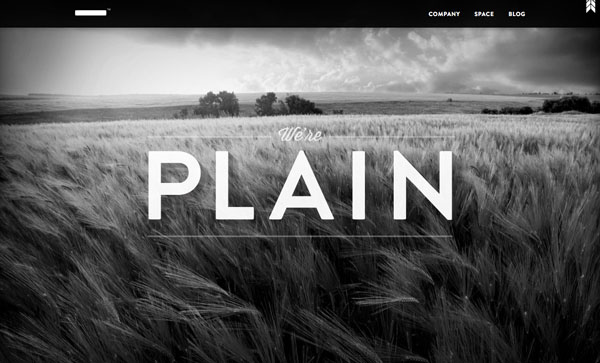
Working with the visual flow of an image is one of the most important tips when it comes to working with text and photos. You need words to fit into logical parts of an image. And please be careful not to put text over important parts of an image, such as the main action in a photo, faces or the product you are trying to showcase.
In terms of visual flow, look for spaces for text where the subjects of the image would look. Both examples about lead you from the body language or eyes of the person in the photo to the text. The flow of each is spot-on.
4. Blur the Image

One of the simplest tools you can have in your kit is the ability to blur part of an image. Adding a little blur to the background of an image with software such as Adobe Photoshop can help your text stand out. Blur can also add focus to your overall concept, such as the Wallmob website above. Blur brings the actual product and text into sharper focus for users of the site.
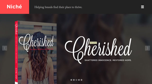
5. Put Text in a Box
When photos contain lots of color or differences between light and dark sections, putting text inside another frame can really make it stand out.
Choose a shape – you can see a rectangle and circle above – that works with your word choices and image. Then look for a color for the box that provides enough contrast for the lettering to show. Consider using a frame with some transparency for a softer feel that allows the image to show through.
6. Add Text to the Background

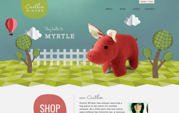
One of the best “tricks” out there is to put the text in the background part of the image rather than the foreground. Typically backgrounds are less busy and easier to work with when placing text. Backgrounds are often a single color as well, making it a location where text color is easy to figure out and even easier to read.
The end result is a natural-looking placement that does not require a lot of tricks or alterations to the main photo. Play with subtle shading effects, such as Caitlin Wicker’s site above, for text placement that also adds an element of depth to the image.
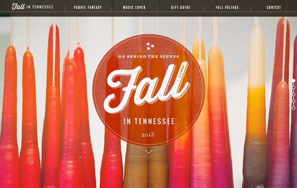
7. Go Big
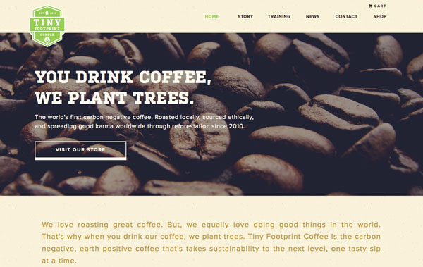
When you are not sure what works, consider going big. This applies to both the image – make it larger than life – or the type itself. The element of size will grab a user’s attention and with one element used large it can make it easier to create scale with the text and image.
Using big images, such as the coffee beans above, can help with shading and contrast differences. Using big text can add enough weight to lettering where it will appear readable against almost any image.
8. Add Color
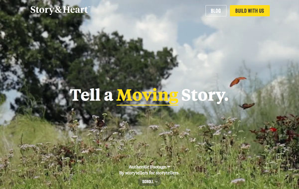
Adding a hint of color can also add visual interest to an image. The sites above take two very different approaches – one uses a contrasting color not seen in the image to highlight certain words, while the other uses a tone that mirrors the image. Both techniques can be equally effective.
9. Use a Color Cast


An effect that is becoming more popular is the use of color casting over images to allow for text placement. While this can be a tricky effect to accomplish, it can also make for a stunning design.
Opt for a color that his high visual interest. The balance is in making the overlay color transparent enough for the image to show through, but not so transparent that the text is difficult to read. You may have to experiment with several color and photo options before mastering this trick. Not sure what color to use? Start with an overlay related to your brand colors.
10. Go Simple
The time-tested design advice “keep it simple” applies to text and images as well. You really want people to see both the photo and the words. Applying too many tricks can have the opposite effect.
When working with images, use simple typography and a straightforward image for the best results. Remember to allow important parts of the image to show without obstruction and keep working n your design until text is clearly readable.