The Pros and Cons of Responsive Web Design vs. Mobile Website vs. Native App
What is the best way for your business to go mobile?
Mobile optimization is becoming more and more trendy these days and it is no surprise. According to Mashable in August 2013, 17.4 percent of all global web traffic came through mobile devices and this number will continue to grow in 2014. So if you don’t want to lose your piece of the pie, it’s time to step into mobile world.
With Postcards you can create and edit email templates online without any coding skills! Includes more than 100 components to help you create custom emails templates faster than ever before. Try now for free!
Learn MoreOther ProductsHoping that industry giants like Google or Apple will adapt your site for mobile devices is not enough unless you don’t mind losing almost every fifth visitor to your site.
Which of the following mobile optimization methods is the best for your particular business?
- Responsive Web Design
- Mobile Website
- Native App
To answer this question, let’s go through each of them and understand their pros and cons.
Responsive Web Design
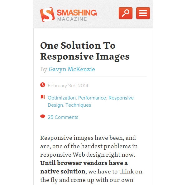
Responsive web design allows you to have a single website that automatically fits the screen size of the device on which it is being viewed. This is achieved by adapting the content, design, navigation and method of interaction to deliver the same comfort and usability to the mobile user as to the desktop user.
This means that you have just one website that looks equally well on all types of devices.
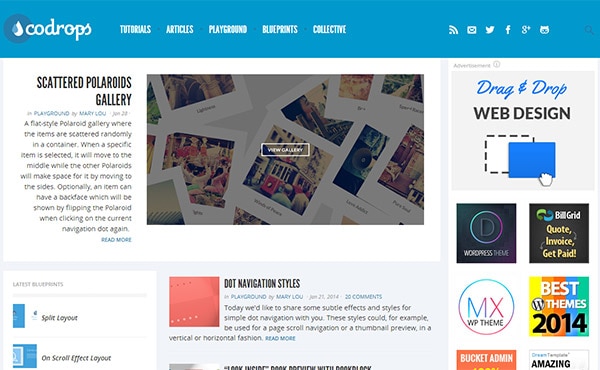
Codrops large
With Slides, we don’t make you start from an empty slate. All you have to do is to pick the elements you like best and combine them. Each slide has been carefully crafted to satisfy three key criteria: aesthetic, function and usability. That way you know every element works together seamlessly while enhancing the impact of your content.
Create a WebsiteCodrops medium
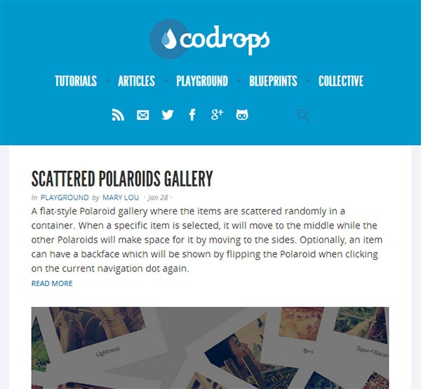
Codrops small

The Pros:
- A single website. It’s easier to administer just one website for all devices.
- A single URL. This makes sure your users will find you on mobile devices without having to wait for redirects, especially helpful on slower connections.
- Easy SEO. There is no need to create specific content for mobile devices, while you still enjoy the benefits of your desktop website SEO on mobile devices.
- Easy marketing. No extra work for the marketing department is required to promote your website on mobile.
- Low cost. Simple math — one website is cheaper than two.
The Cons:
- A single website. Having just one website for all devices may be easy for you, but not always for your users. You will often need to put different emphasis on the same page in order to maximize conversions using the advantages of the platform.
- Technical. As responsive web design is a relatively new technology, there are still some outdated devices with old browsers that will load the website too slowly or even not fully.
- User Experience. Mobile is a completely different experience than desktop, so having a single, even responsive website, may harm your overall UX on both platforms. If you try to satisfy both mobile and desktop users with the same user interface, you may end up satisfying no one.
Responsive web design can be a very powerful tool in certain situations, but it is not an ultimate solution.
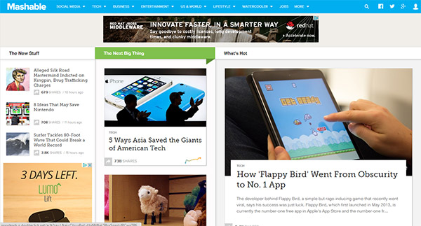
Mashable large
Mashable medium
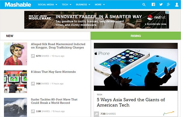
Mashable small

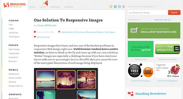
Smashing Magazine large
Smashing Magazine medium
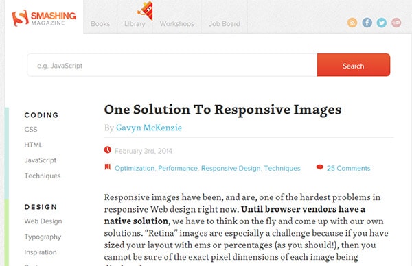
Smashing Magazine small
Mobile Website
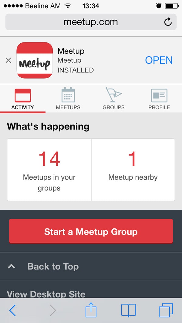
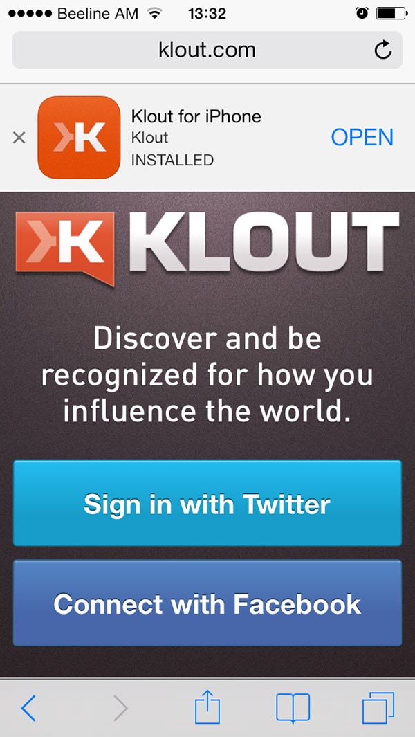
A mobile website is designed specifically for mobile devices considering all the limitations and opportunities of the platform. While developing a mobile website you should keep in mind the small screen size, interaction methods (touch) and limited connection speed (2G/3G). Content must be easily accessible, fast-loading and readable. As there are a bunch of mobile devices with different screen sizes and interaction types, it is impossible to create a website per device type. So even your mobile website has to be a little responsive to fit every screen.
There are also a few principles to follow when developing a mobile website, like organizing your content into one column layout for a more ergonomic user interface.
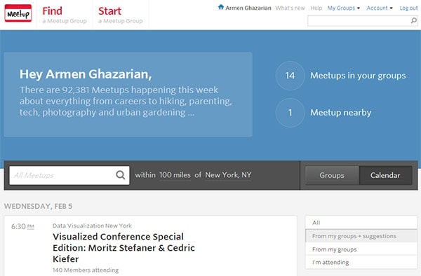
Meetup web
Meetup mobile
Meetup app
The Pros:
- User experience. Congratulations! You have a website that is specifically optimized for mobile devices, considering all benefits and limitations of the platform, so you have a good ground to create a beautiful and usable UX.
- Speed. Your website will load fast and easily on mobile platforms.
- Cost. Building a mobile website is not a cheap option as compared to responsive web design, but still you can get a very reasonable price for the value.
- Benefit from local search. Search engines tend to provide good UX nearly as much as you do, so in local search results mobile optimized websites have better chances to rank.
- Immediately accessible. Though not an extra advantage over responsive websites, but it still plays its role compared to native apps, where users have to pass through download and installation processes.
The Cons:
- Multiple URLs. Your customer has to remember at least two URLs, or otherwise be redirected to the mobile website, which takes several seconds. The mobile website will need additional SEO work as well.
- Maintenance. You will have to maintain two websites.
- Not Universally Compatible. You have to consider that there are two different types of mobile devices: touchscreen and keyboard navigation. A single mobile website won’t look and work the same way across all device types.
Klout web
Klout mobile
Klout app

Native App
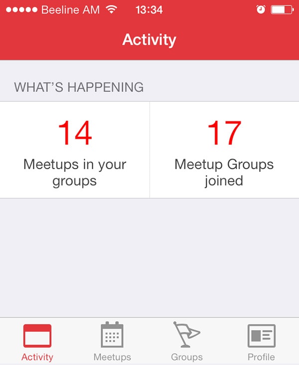
A native app is a software specifically developed for mobile devices. Native apps are not common among all devices, because they are made for a particular operating system. Users have to download the app mostly from a specific OS store, like Google Play or the Apple Store and install it on the mobile device.
The greatest thing about apps is that they are flexible and let you have not only the same stuff that is on desktop website, but also employ awesome mobile-specific features such as use of camera, click-to-call buttons, GPS data or NFC, contacts or galleries etc.
The Pros:
- User experience. Native apps can have better UX than any other mobile optimization solution.
- Accessibility and speed. Applications can operate even without internet connection making all your information available at any time. And if you are lucky enough to have an experienced and virtuous coder, your app will also load fast and smoothly!
- Everything you can imagine. Here’s where you can and should think out of the box and get creative. Mobile platform, especially with touch screen navigation, gives you mass of features to work with in order to provide excellent UX.
- Visibility. Once a user has installed your app on a mobile device, it stays there, showing up with its unique icon in apps menu.
The Cons:
- Not accessible on all devices. Your app is built only for a particular operating system and this means it will not operate on devices with different OS.
- Goodbye flexibility. All application updates will have to be submitted and approved by the app store every time, which can take up to a few weeks. Not every user will be happy with frequent updates and some will stay with the older version anyway.
- It’s quite costly. Native mobile app development is clearly the most expensive solution.
- Marketing and SEO. A completely different marketing strategy must be applied for your mobile app promotion and you may need help from a mobile marketing professional.
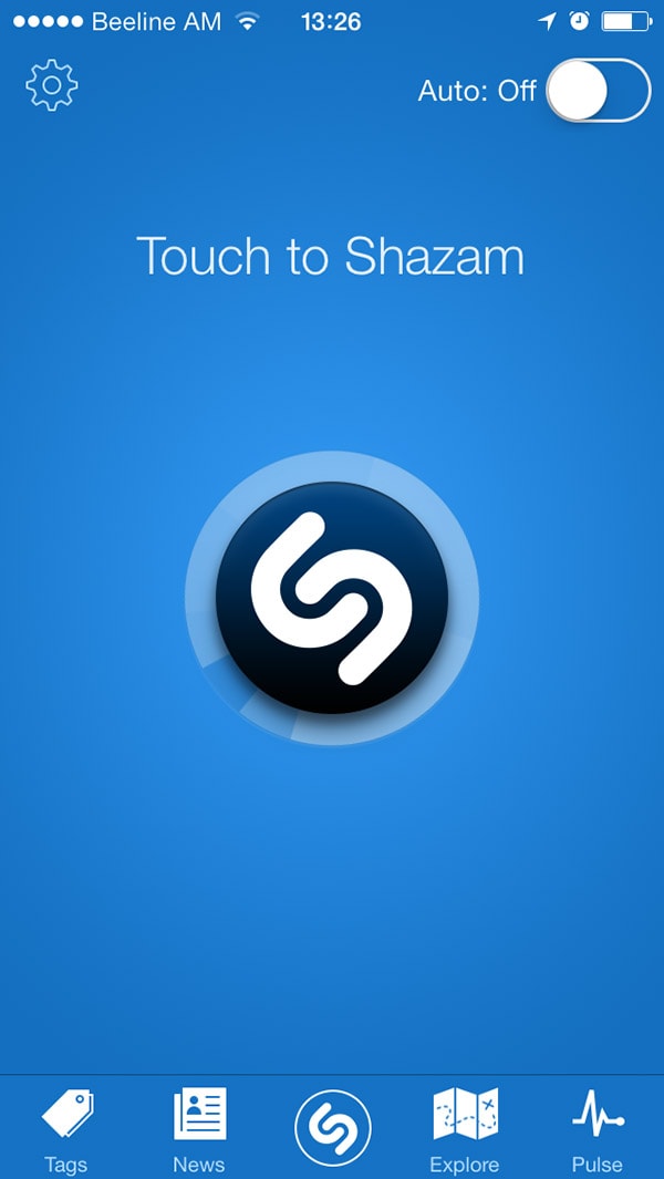
Shazam app
So which solution is the best for your business?
To answer this question you should consider your business goals. Of course, there is no reason why a business can’t have both a mobile website and native app. Or you may choose to have a responsive website for desktop and tablets, a mobile website for mobile phones and also be presented with a native mobile app in each of the OS app stores. This basically depends on the scale of your business and the budget you are willing to allocate for the project.
If you have frequently updated content, a responsive designed website is to easily update and administer. If your business requires cross-platform operation with flawless UX and excellent performance, native apps beat the competition.
So when making a final decision on which of the mobile optimization methods to choose, keep in mind three keystones: Your business goals, your budget and industry features.
All these solutions can very well work together and complement each other. But one thing is clear: The best solution is the one that works best for your user!
