Infinite Scrolling: Is It Good or Bad for Your Website?
Like any other design trend infinite scrolling is becoming increasingly popular and you will frequently come across one page websites where you scroll down as much as you can but never reach the bottom. So is this is a good trend to follow for your website or you would rather avoid it?
Well, the answer is simple. It depends on the type and goals of your website.
With Postcards you can create and edit email templates online without any coding skills! Includes more than 100 components to help you create custom emails templates faster than ever before. Try now for free!
Learn MoreOther ProductsAs Nielsen Norman truthfully mention “Infinite Scrolling Is Not for Every Website”. It has its strengths and weaknesses, but before deciding to implement infinite scrolling on your website you need to make sure that the advantages it offers are way more valuable than its disadvantages.
Infinite scrolling is basically a type of web interaction design that allows users to browse the content through scrolling rather than clicking on page links. This way new content is being automatically loaded and ready before users get to that point, while in case of pagination, content for each page starts loading after clicking the page link.
This web design technique is successfully employed by such social network giants like Twitter, Pinterest, even Facebook and it’s no surprise that many websites follow their lead…and fail. The reason why infinite scrolling works so well on Twitter and Pinterest is not that they are established and multi-billion companies. It’s because these websites have a huge flow of user generated content that is continuously updated. In this case infinite scrolling proves to be the best solution to provide quality user experience.
The Pros
So what are the benefits of infinite scrolling that many websites nowadays opt for?
Perfect for Touch
In today’s multi-device world it is of utmost importance to have equally good UX on both desktop and mobile devices. And since most of the tablets and mobile phones are made with touch technology you would prefer to focus on touch optimization. Here’s where infinite scrolling beats the competition. The small screen size of a mobile device demands a forward-thinking technology to display the content in a way that is more convenient for the user. Making users to tap those tiny page links to get to a new bunch of content is far from being usable.
With Slides, we don’t make you start from an empty slate. All you have to do is to pick the elements you like best and combine them. Each slide has been carefully crafted to satisfy three key criteria: aesthetic, function and usability. That way you know every element works together seamlessly while enhancing the impact of your content.
Create a WebsiteVisual Oriented
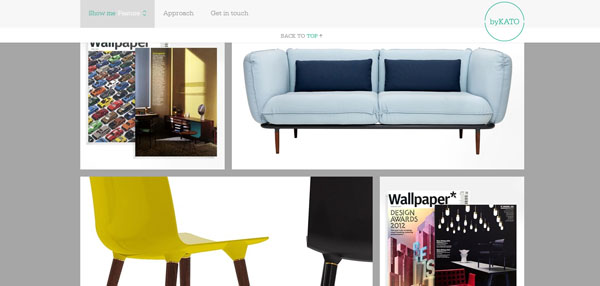
Who doesn’t like high quality beautiful images? This is probably another emerging trend on the web that is based on “a picture is worth a thousand words” principle. And the best way to deliver image-heavy content appears to be infinite scrolling. This way users won’t be distracted from their delightful experience by the need to find and click the next link. Pinterest and Flickr are great examples of how visual oriented websites benefit from infinite scrolling.
Better Content Exposure
Regardless of the type of content your website is offering you would like to get as much impressions for it as possible. In case of content pagination users won’t see what’s on the next page until they click it, while infinite scrolling puts all your content on one endlessly long page. Everything is within a “scroll’s reach”.
Fast and Easy Browsing
Infinite pages are usually faster than regular webpages. The reason is that as the user scrolls down the page, more content loads automatically in the same page eliminating the need for clicking on page links and reloading pages every time. This saves time, which is good not only from a user’s but also from SEO perspective.
More Room for Creativity
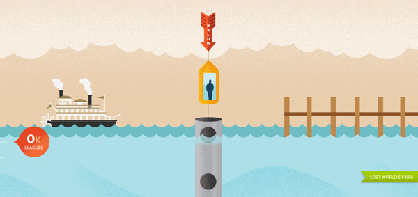
Infinite scrolling itself is a quite innovative way for displaying information, yet it also holds a huge potential for creative outbursts. In the hands of a web design virtuoso infinite scrolling can turn into something not only interesting and usable but also fun. A very good example of such creative approach can be found on lostworldsfair.com and andrevv.com.
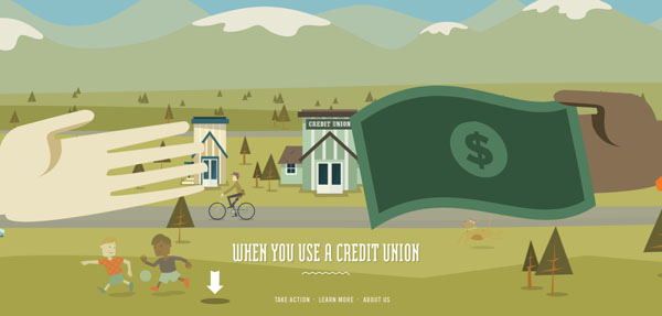
A very popular creative extension of infinite scrolling is the parallax scroll technology that creates beautiful visual storylines through scrolling. Check out makeyourmoneymatter.org and cyclemon.com for best practices.
The Cons
As said above infinite scrolling makes it easier for users to consume more information with less actions on their side. Sounds quite appealing, doesn’t it? But let’s now go through the list of infinite scrolling drawbacks that you should keep in mind when making a final decision.
This is a very big issue especially for ecommerce websites. If you have made an online purchase at least once you know exactly where all the important links are located: in the footer. Now imagine you want to visit the “Shipping information” page on an infinite scrolling webpage. Catch it if you can! It is pretty annoying when you have just a few seconds to find and click on that link until it “scrolls away”.
Disorientation
Everything there is on the web is basically recreated from the real world, right? From this point of view anything that is infinite is already unnatural and contradictory. If there is no order we won’t be able to handle the immense amount of information that flows into our lives every day. And we come across the same issue with infinite scrolling. It lacks orientation and users have difficulty finding something they have previously seen on the page. They are unable to mentally locate that item and easily come back to it afterwards. In case of paginated content at least you can relatively map the information with the help of page numbers.
Moreover, that scroll bar on the left gives inaccurate information about the amount of content that is left to load and users feel cheated and annoyed when they realize there is still more to come.
One of the very basic UX principles states that users need to always know where they are in the hierarchy of a website. This is essential for website usability. In case of infinite scrolling it is very difficult if not impossible to understand where you are at a given point. Moreover, when you click on an item and then want to go back where you left, the “pogosticking” thing happens and you are brought back to the very top of the feed. Imagine how annoying that is.
No Skipping
One of the biggest advantages of paginated content is that when needed you can skip the first let’s say 100 pages and go straight to 101st, which is impossible with infinite scrolling. Users can’t even nearly imagine the amount of content there is, let alone skip a part of it.
Browser crash
No new technology works flawlessly on all browsers and infinite scrolling is not an exception. When a big amount of content is loaded the memory of a computer, especially an older one can easily crash. You don’t want such UX, do you?
Overwhelming Content
It’s always good to have lots of quality information on a website. But when there is infinite content loading every second users may feel out of control and exhausted. It’s like a pleasant road trip that has no destination and never ends. Knowing there is so much more information out there users are unable to stop until they get bored and psychologically daunted.
After all, is infinite scrolling good or bad?
Every advance in technology is a good thing if used properly. As for the infinite scrolling, for some websites it proves to be beneficial and engaging, while for others it can backfire and crash the whole UX. It all depends on the goal of your website and the user expectations. If you have a goal-oriented website, where users perform specific tasks and expect to find specific results, infinite scrolling may hurt the website usability due to its disadvantages listed above.
But if there is a plenty of content on your website and each piece of it has nearly the same value and same importance level for a user, then infinite scrolling can be a really effective way of delivering that content. Take for example lookbook.nu. Every single post features some visual content with the same chances to be interesting for a user.
Based on many expert opinions and practical experience, infinite scrolling doesn’t seem to perform well for ecommerce websites and the already popular case of Etsy online shopping website proves that once again.
However, if you choose infinite scrolling as the best option for your website, try to apply some best practice techniques to make sure that your website meets user expectations. First of all stick the navigation bar to the top of the webpage and make it visible persistently. Try to combine traditional pagination and infinite scrolling by adding a “Load More” button at the end of the page, allowing users to decide whether they need more content or it’s enough. This way you will also have a normal footer. And finally make sure users can come back where they left if they click on an item in the feed.
