How to Create User-Centric Apps for Kids
A good UX is all about making the digital environment as intuitive as possible, not making the user think as Steve Krug would say. The same principle is applied even in greater force to digital products designed for kids, and there are several reasons why.
First of all, kids are a completely different audience than adults and they require a different approach to both graphic design and UI development. Children are very sensitive and susceptible to what they experience in their life and the border line between reality and digital stuff is very thin in kids’ world. That’s why the content you deliver to this audience should be of appropriate quality, positive, fun and educative. But these points should by no means affect the UX of your app, because if in case of adult audience you could give up some usability principles for better SEO or easier coding, here you cannot afford that luxury, because kids do not have the patience and may never open your app again if they didn’t like it.
With Postcards you can create and edit email templates online without any coding skills! Includes more than 100 components to help you create custom emails templates faster than ever before. Try now for free!
Learn MoreOther ProductsThough it is pretty hard to satisfy the randomly changing needs and wants of kids and teenagers, you have no other choice than accepting this challenge, because nowadays tablets and mobile phones are the absolute leaders in children’s wish lists regardless of age.
So if you want to design a usable app for kids, it’s good to start with the definition of the word “kid”.
In his theory of cognitive growth, Piaget describes five stages of children’s cognitive development:
- 0-2 years: sensory-motor intelligence;
- 2-4 years: preconception thought;
- 4-7 years: intuitive thought;
- 7-11 years: concrete operations;
- 11-15 years: formal operations.
In this article we are focusing mostly on younger children, up to 7 years old, because the gap between them and adults appears to be greater and so is the difference in UX.
If after all you are ready for this challenge, you might come up with an overly successful business idea that is fun, playful and profitable at the same time.
Think like a kid
Throughout the design process you should always keep in mind the end user of your product and try to imagine how they would interact with this or that feature. Ideally, you need to do a user research for your particular product to have a more reliable data source than your own imagination. And since children can be ruthlessly honest about your app, they will be the best judges.
With Slides, we don’t make you start from an empty slate. All you have to do is to pick the elements you like best and combine them. Each slide has been carefully crafted to satisfy three key criteria: aesthetic, function and usability. That way you know every element works together seamlessly while enhancing the impact of your content.
Create a Website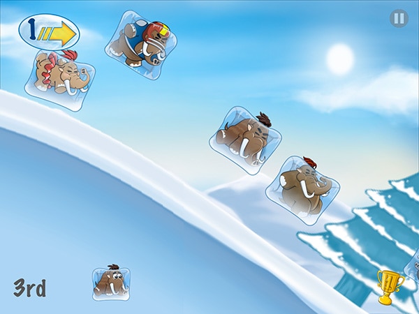
In general, though, you need to create something playful and highly interactive. Kids expect to see something happen when they tap on a visual element. And if nothing happens, they will tap it again, then slap the device with a hand, a shoe, a toy and eventually scratch or damage the device. To avoid this type of accidents, you could use a plenty of sound and animation effects.
Unlike us, adults, children not only do tolerate but even love loud sounds and playful graphics in an app. But remember that motor skills of your users may not be fully developed, so you will need to exaggerate some graphics to make them more ergonomic and usable for children.
Understand kids’ gestures the right way
The good thing about designing apps for kids is that they interact with mobile devices on a quite intuitive level.
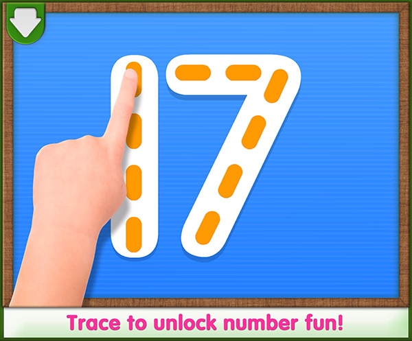
Remember how they use tablets. Tap is the most intuitive and natural interaction gesture that children use. Tap is the evolution of pointing with a finger, which is the very first interaction method that children use to explain what they want. But even children’s tapping is different from that of adults’; kids prefer to tap and hold, rather than tap and release.
Another thing to consider is the swipe gesture. If adults think of swiping as a way to turn pages in an app, kids treat that gesture a little differently. Intuitively they use swiping to relocate objects on the screen as they would in real life.
Kids love playing together, so applications for kids should allow multi-touch for a more enjoyable experience. Multi-touch makes for a highly interactive interface, which your target audience will love. But consider that children may hold the device differently in order to adapt it to their hand size, so for instance the use of an accelerometer as an interaction method is not a way to go. Requiring the device to be tilted or turned can lead to an undesirable and expensive accident. Try to keep interactions limited to gestures.
Designing a good navigation for kids’ apps is actually a very challenging task, because kids tend to touch everything they see and can be easily redirected from the main screen to a place where they can get lost and in panic close the app as a way out.
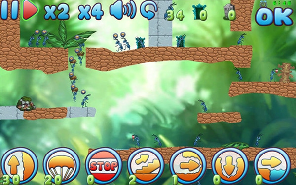
It is better to have more images and less text in the navigation, especially considering your audience probably can’t even read at all. Try to use images and icons that are familiar for kids, for example their favorite cartoon characters. Pair them with some pretty animation effects and you already have a delightful and usable navigation.
Learning through play
It’s no secret that all parents want their kids to start learning as soon as possible, but few of them know how much kids themselves want to learn new stuff. They are like little expeditors, who absorb everything so quickly that you can hardly imagine. Digital media offers almost endless possibilities to serve this desire to learn in a more fun and interactive way through games and other playful apps. But kids can easily get bored or distracted and when they do, they will immediately close your app and move on to something newer and more fun. So kids’ attention is hard to attract and even harder to keep.
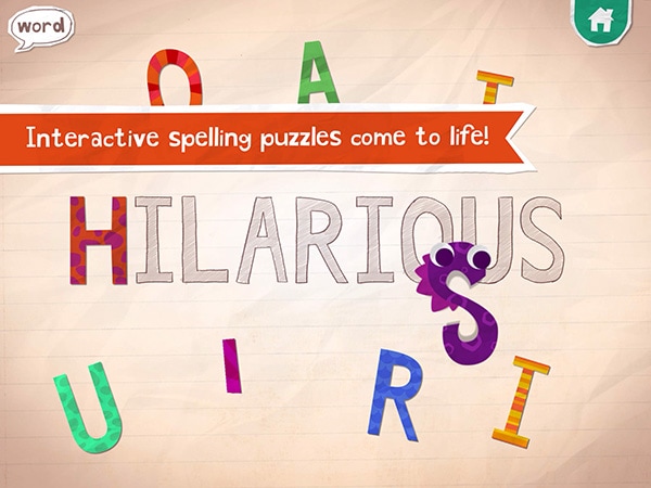
The best path to learning is repetition and children, especially younger ones, tend to repeat everything a thousand times: they can watch the same video, listen to the same song over and over again until their parents start hating it. However, your app shouldn’t deprive their wish to repeat some stuff, so make sure to provide children a simple way of repeating actions. Whether it is being able to press or tap a button over and over again, or replay a video.
Think like a parent, too
Everything said above will help you build an app that kids will probably love to use, but the tricky part is that your app must as well be approved by their parents. For this reason you just have to avoid being sneaky and taking advantage of the kids’ lack of caution. This first of all refers to in-app purchases and banner ads. Unfortunately kids don’t experience banner blindness like most of adult users and are sure to tap the banner to see where it takes them and it will take them out of your app, maybe forever.
As for in-app purchases, parents view it as a potentially large money loss, fearing that kids might accidentally drain their credit cards away. To solve this issue your app can require confirmation with some security open end question or a password for every single in-app purchase, thus preventing kids from unwittingly buying add-ons and extras.

