The Year on Designmodo: Best Articles, Freebies and Products
In 2013, several important web design and development techniques emerged.
Here at Designmodo, we work to publish only the best articles and resources, and we’ve decided to prepare a list of the top articles and resources for 2013 on Designmodo. Of course, many topics remained uncovered, and we hope to guide design in right direction in the coming year.
With Postcards you can create and edit email templates online without any coding skills! Includes more than 100 components to help you create custom emails templates faster than ever before. Try now for free!
Learn MoreOther ProductsIn 2013, 17,800,000 people visited our website and we are sure that we helped many designers and developers along the way.
We’ve gathered the best articles, freebies and products that became most popular in terms of views and shares in the social media.
Best articles for 2013

Designmodo was one of the first resources to start writing articles on Flat Design, thus we tried to explain to our readers what flat design is and what its advantages are as compared with other design techniques. In this article, you will learn the basic principles of Flat Design.
![]()
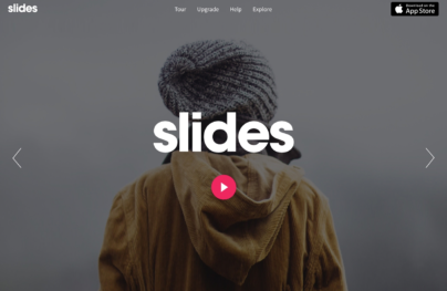
With Slides, we don’t make you start from an empty slate. All you have to do is to pick the elements you like best and combine them. Each slide has been carefully crafted to satisfy three key criteria: aesthetic, function and usability. That way you know every element works together seamlessly while enhancing the impact of your content.
Create a WebsiteThis article focused on the idea of responsive iconography in web design. The topic proved to be very interesting, and received quite a bit of positive feedback. We hope that this topic will become a practice for all developers in 2014.

Having explored the topic of flat design, we decided to publish an article dedicated to colors which are most widely used and suitable for this design technique. Of course, nobody creates any limits for designs, but let it be your first experience in flat design creation.

Another trend, which became very popular among designers, is long Shadow design. Following the topic of flat design, we presented this new icon creation technique, as it is mainly used for them.

Many people asked this question, but now, there is an answer, and it was described in detail in this excellent article. We advise you to read and share it with your employers or clients.

This article describes several thoughts and the practice of creating a form for credit card payment. This article is useful for everyone who deals with financial transactions and online payments.

In general, typography and quality of reading on mobile devices is weak. This article gathers a couple of good examples of what do to for your website to be more readable.

How do you start creating design for applications? What tools are there, and how do they work? You will learn all this and many other things from this article.

For all those who work in a team, it is obligatory to read this article. Proper work habits in PSD can accelerate the design process in browsers and on users’ devices. Respect your work, and the work of others.

You’ve always wanted to make a large menu for your site, but never knew how to do it? This article will teach you to do it, and you will even be able to download the code for this menu free.
Other Articles:
10 Wireframing and Prototyping Tools for 2013
Designers Workspace: Creative and Inspirational Examples
Grids and Icons for Creating iOS 7 Templates
Vertical Navigation Implementation of Side Menu in Mobile Apps
Beautiful Examples of Login Forms for Websites and Apps
LESS – The Dynamic Stylesheet
Everyday Design: 10 Sources of Web Design Inspiration
How to Choose a Typeface
Using the Parallax Trend to Create Visual Interest and Surprise
Trends: Going Bigger with Typography
A Simple Guide to Creating iOS7 Style Icons
Free PSD Perspective App Mockups
Use of Flat Design in Mobile App Interfaces, Best Examples
Flat Design and Fonts
Cool Tools are a Must-Have for Web Designers
Best Freebies for 2013

Probably our most popular UI Kit (framework). After the release of Flat UI Free, the largest Internet magazines such as Mashable, TheNextWeb, SmashingMagazine, Venture Beat etc… started writing to us. Thanks to everyone for your support and promotion of this product.

Square UI Free is the first UI Kit that was created in the style of Flat Design, and is still very successful.

A marvelous set of icons in the veins of minimalism, that has rounded edges. Download them for free and use in your projects.
Startup Design Framework

Currently, Startup Design Framework is our flagship product and we are proud of it! This comprehensive Framework was created with a beautiful design, and very good code. All you need is to change design blocks in the code, to create new and nice projects. We look forward to your suggestions for developing this product in the coming year.
Flat UI

For a long time, this used to be our main product, which of course had appeared following the trend. We couldn’t leave Flat Design unattended, and decided to create a comprehensive framework in the Flat style. We continue to develop this project, and each month we release new updates and adjustments.
To our readers
The Designmodo team is grateful to all those who read and shared our articles throughout the year. Thanks to our customers, without whom we wouldn’t make such beautiful and advanced products.


