Great Typography in Mobile Apps – 8 Best Examples
Here is a good quote:
Following article is a chapter of a free ebook by UXPin – The UX Design Platform and Movade (media partner – Designmodo) – Mobile Design Trends 2014.
Online HTML Email Template BuilderWith Postcards you can create and edit email templates online without any coding skills! Includes more than 100 components to help you create custom emails templates faster than ever before. Try now for free!
Learn MoreOther Products
And another good quote from my friend:
I have a small theory that I’d like to share with you – great typography equals design maturity. Web designers, until a couple of years ago, weren’t paying nearly enough attention to typography. When the whole field matured – typography blossomed and became a huge design trend.
Good typography is not only decisive when it comes to the readability of the text, but also builds up a message that the designer intended to share. It’s an important part of the overall user experience. On the other hand, a lack of good typography shows the unprofessionalism of the whole product. Text is a basic ingredient of the majority of interfaces – if that’s designed badly, why go any further?
The first years of the growth of native applications on iOS and Android were just terrible. It seemed like the majority of designers and developers weren’t thinking about typography at all. It was under-appreciated and looked accidental. Boring fonts were usually applied with no good taste. A design nightmare.
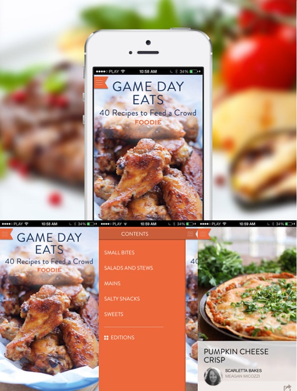
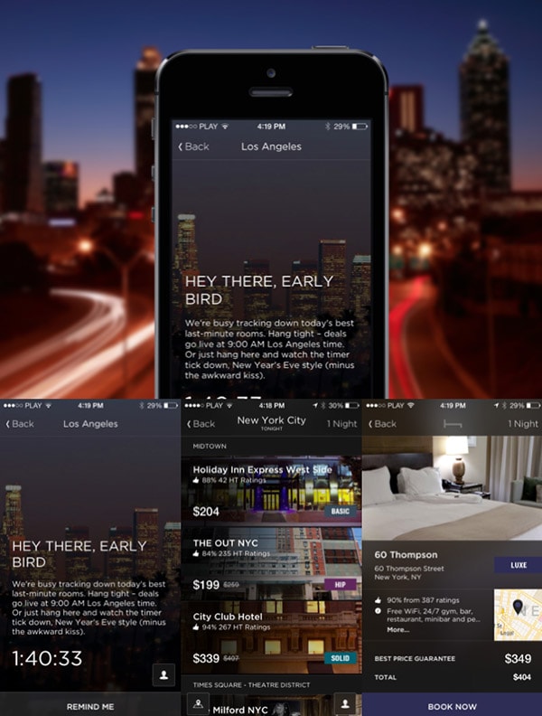
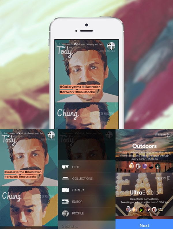
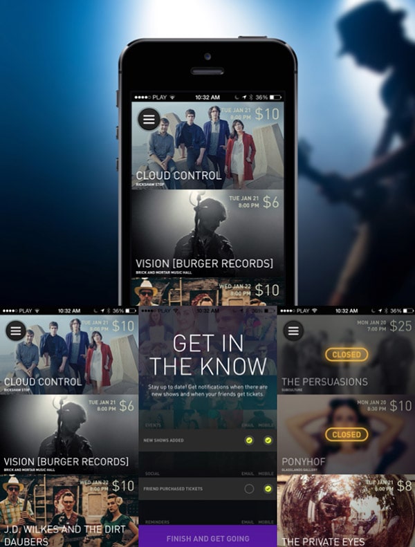
Mobile design is long past its early days now and we can clearly see signs of the maturity of the field. Typography is one of the most vivid examples. Most of the typography on popular applications can be described as “decent”. Whether that’s Facebook, Mailbox, or Twitter – the text is clear and the fonts look at least OK. What’s even more interesting – in 2013 we saw lots and lots of mobile apps with an absolutely stunning usage of fonts. Ultravisual, WillCall, Hotel Tonight to mention a few great examples.
In 2014 we’re absolutely sure that this trend will gain even more power.
With Slides, we don’t make you start from an empty slate. All you have to do is to pick the elements you like best and combine them. Each slide has been carefully crafted to satisfy three key criteria: aesthetic, function and usability. That way you know every element works together seamlessly while enhancing the impact of your content.
Create a WebsiteTypography in mobile apps can’t be ignored anymore. Mobile design has reached its maturity.
Citroen Lifestyle, iOS
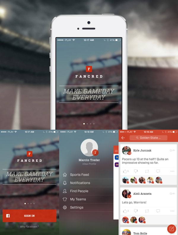
Fancred, iOS
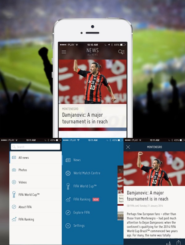
Fifa, iOS, Android
Foodie Recipes, iOS
Hotel Tonight, iOS, Android
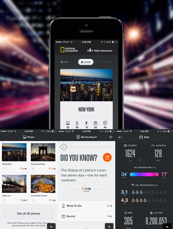
National Geographic City Guide, iOS
