Lorem ipsum example article
Good contact form design means big things for your business. According to statistics, 74% of lead generation depends on it. Moreover, it is one of the essential tools to communicate with potential clients and conduct marketing campaigns. However, the importance of optimizing web form design always stays overlooked.
Entrepreneurs naively believe that all they need to do to generate traffic and boost conversion is to add a web form to the page. However, it is not that simple. The deal is people do not like web forms. Whatever small or big, users do not have any desire to fill them out. There are many reasons why this happens. For instance,
- SPAM fears. Giving your email address is a regular thing; however, it always raises concerns about whether it will be used for spamming.
- No way out. When you fill out a form, especially a registration form, it feels like there is no way out since it is always hard to delete your account.
- A leak in information security. People are afraid of their personal data being sold or exposed.
- Too much work to do. Sometimes people are not in a mood.
- Too much time to spend. People can be in a hurry.
- Too much information to give.
- Ask for personal information. People do not like to share personal information; even giving the surname may be an issue, to say nothing about credit card, day of birth, or mobile number.
There is a whole bunch of reasons that stop your users from filling out your perfect contact form design. Therefore, it is not enough just to add a web form. Your task is to bring users around. For this, you need to make them feel comfortable and secure as well as ensure that their actions will be rewarded.
Let us consider some good tips on how to create web form designs that are pleasant to use, accessible to everyone, secure and easily convertible, along with a collection of practical contact form examples.
Contact Form Design: Basics
A regular web form design consists of input fields, submit button, and agreement for Terms and Conditions. While the latter two are apparent, the first constituent comes in all shapes and sizes. Depending on the type of form, you may need different kinds of inputs. It can be
- Text field,
- Password field,
- Telephone number field,
- Date field,
- Checkboxes,
- Radio buttons,
- Lists,
- Drop-downs,
- Multiple line text fields and others.
As for the web form examples, there is a sheer diversity of them as well. The most popular ones are:
- sign up form,
- login form,
- payment checkout,
- comment form,
- booking form,
- subscription form,
- and, of course, contact form.

Hello World Agency Portfolio Website by outer
Tips to Design Contact Forms Pleasant to Users
The well-thought-out web form design is what bridges the gap between cold digital interface and people. It underlies so many things that it can easily ruin everything when poorly done. Therefore it should be well treated. Follow these best practices to create contact form design pleasant to users:
- Add a clear title and description to the top.
- Use colors with caution. Although, red is the highest performing color, however, it is widely associated with errors. Therefore, it may backfire. Go safe. Use neutral or brand colors.
- Add space between fields. No one likes tightly packed contact form designs.
- Mark required fields with asterisk or “(required)”.
- Differentiate the primary and secondary buttons.
- Make the submit button stand out from the crowd. Use time-proven colors like green and blue that instantly identify the designation of the component and widely associated with the business.
- Go for left-aligned forms instead of centric or right-aligned.
- Find the sweet spot for your contact form. Choose banal places since your users will check them in the first place.
- In case of a long-form, use a wizard or progress bar. Add the “Save” button to protect users from losing the current progress.
- Design field validation Take into account small and mid-sized screens to not ruin the entire aesthetics.
- Design tooltips for serving additional information in a non-intrusive manner.
- Avoid long drop-down menus.
- Divide content into logical groups.
- Use your approach with caution. You can be creative; however, the routine should be straightforward.
- Use components appropriate for iPhone and Android devices like swipeable lists.
- Benefit from the device orientation to use all the available space on the screen.
- Add support for voice-driven inputs.
- Use GPS inside the device to determine the location or time zone to fill out corresponding fields automatically.
- Personalize your “Thank You” page.
- Do User Testing. Adjust your form to meet the current requirements of your crowd.
Finally, yet importantly, make a mobile-friendly web form design. According to marketers, the user experience of your mobile form is key to higher conversions. Therefore, adapt the design to small screens is a must-have. Keep an eye on such important things as
- The size of the fields. Sometimes you should make them bigger to match the finger area or to make them visible for people with vision impairment.
- The position of labels. They may undergo changes.
- The styles for errors. You need to create a specific set of rules for pointing out the user’s mistakes.
- The retina screens. If you use low-quality images or icons, they may ruin the whole aesthetics. Use scalable graphics.
Contact us form by Lena Zaytseva
UX Tips for Contact Form Designs
Empirical Evaluation of Web Form Improvement Guidelines created by individual researches and Google team include 20 tips on how to create web form design with a good user experience. We have compiled a list of critical takeaways along with some good recommendations provided by a respectful community of UX researchers to give you a head start in this area.
Form content
- Let people provide answers in a familiar format.
- Keep questions in an intuitive sequence.
- Make form as simple as possible.
- Ask only vital questions.
- Use autocomplete.
Form layout
- Place labels above the fields.
- Do not split the form into two columns or more.
- Ask one question in a row.
- Highlight field that should be filled out next. Use autofocus so that users do not lose track.
Input types
- Use appropriate input types.
- The size of the input field should match the length of the answer.
- Determine the required fields.
- If you need multiple answers, use checkboxes.
- To restrict the number of options, use radio buttons or drop-down menus.
- Use checkboxes, radio buttons, list boxes, and drop-down menus to make clear what kind of answer is expected.
- To avoid format errors, use appropriate input fields: date, phone number input, password input.
- If an answer required in a specific format, inform users in advance. Show an example right near the input field or inside by using a placeholder.
- Use labels with text of currency for finance fields.
Error handling
- Error messages should explain the problem in simple words that are understandable by a large crowd.
- The error message should explain how to fix the problem.
- Error messages should be clear and visible. Use red color to highlight the problem.
- Never clear fields where mistakes happened.
- Disable the submit button after the form submission.
- Do not add a reset button to keep users away from accidentally clearing all the input fields
- Immediately validate fields.
Form submission
- After form submission, show confirmation message or confirmation page. Say thank you and explain what happens next.
- The purpose of the form should be declared in advance. This will help to establish trust in users.
- Make instructions clear.
Contact us form by Prakhar Neel Sharma
How to Create Contact Form Designs that Convert
Excellent design and optimal user experience do not ensure a high conversion rate. The advice from SEO and marketing specialists – who know best what will help to improve completion conversion rates – come in handy. Let us consider some of their tricks based on real-life contact form examples:
- Start with the value proposition. People should know why they do this. Declare benefits of filling out the form; though avoid creating a wall of excuses.
- Use such words as “easy”, “guarantee”, “save”, “new”, “proven”, “results”, and “free” to motivate users.
- Ensure your users that their personal information will be safe with you.
- Ask easy questions first. Let users feel they are doing a great job. Begin with the name or email address since people are accustomed to giving away this information all the time.
- Never ask for a telephone number. Ask for an email address instead. First, build trust and prove that your company is a reliable partner, and only then collect such personal information as a telephone number or credit card.
- Use as few input fields as possible: ideally one or two. Compact contact form design is much preferable by people.
- Avoid Captchas. Whatever controversial it may sound, according to surveys, traditional Captcha scares people away. It has a negative impact on the conversion rate. If you concern about the security issues, use reCaptcha. It is less intimidating. Use the most straightforward option – a checkbox with “I’m not a robot” label.
- Avoid generic “Submit” for a button. Choose the word that fits the goal to remind users why they are doing this. According to Quicksprout, “Click Here,” “Go,” “Download,” and “Register” are much more preferable.
- Add ghost text in fields. If you have labels, you should not double the information. Use placeholders to show examples like 123-4567-8900 or hint at formatting like mm/dd/yyyy.
- Use tooltips to provide more information.
- Place form above the fold. If you place it on the bottom, chances are people will never see it. Stick to banalities, and you will eliminate the guessing game for your potential clients.
- Show social proof. Impress users with statistics. For example, tell them that thousands of people have already signed in.
- Allow social media First, it is a backup, an alternative way to sign in or register. Secondly, it is definite proof that you are serious about your business.
- Tell users what happens next.
- Reward users for submitting. It can be a custom “Thank You” page or even a small bonus.
- Last but not least, do A/B tests. A/B test will help you to find the best match for your audience. Maybe you need to change the location of your form from right to left, or maybe you use too drastic color, and you need to switch from red to green, or perhaps the title of the form is not trustworthy. Success lies in the details, and A/B tests help to find these details and improve them.
Contact Us by Ivan Poddubchenko
How to Create Web Form Designs Accessible to Everyone
We have considered good tips on how to perfect the web from design outside. However, what about the inside? It is here where AT technologies get all the instructions. Contact forms are a source of confusion for everyone, and users with cognitive disabilities and visual impairments are no exceptions. It is your task to make all groups of people happy. The more so, when the web form design meets accessibility requirements, everyone reaps the rewards.
Follow these recommendations to make your contact form design comply with the standards declared in WCAG 2.0:
- Choose the proper background and colors for elements on the foreground to strike the optimal contrast and ensure excellent readability.
- If you use images, set ALTs.
- Use typography with crisp letterforms. No cursive, handwritten or fancy fonts.
- Make the space between fields evident.
- Choose a color that will separate the form fields from the background.
- Use autofocus.
- Make keyboard navigation flawless.
- Mark form labels correctly.
- Explicitly bound labels to relevant form fields.
- Use “for” attribute to identify the purpose of the field for screen readers.
- Use <fieldset> and <legend> to group inputs logically and describe their designation.
- Use fieldset to provide a visual distinction and semantic information for assistive technologies.
- Use labels and legends to provide an additional descriptive context.
How to Avoid Spam in Web Forms
So, now you know how to create contact form design that is accessible to all groups of people, has a beautiful design, provides excellent user experience, and appeals to the target market. However, we still did not touch one of the most important things – how to avoid spam.
Spam is a big issue that will not go anywhere anytime soon. Everyone has to deal with it. However, it may come as a surprise, but the internet is teeming with web forms examples that do not have any protection. The deal is people are divided on this matter.
The main reason for the disagreement lies in the fact that spam can be of two origins. The first one is generated by bots or programs automatically. The second one is created manually by people. While the former can be stopped, to avoid the latter is nearly impossible.
Therefore, without manually checking your submissions, you just cannot survive. That is why some business owners prefer to ditch all the security measures for the sake of unstoppable traffic, while others try to protect themselves from the intruders at any cost.
Consider various strategies how to avoid spam in web form designs so that you can decide what measures fit your business, ideology, and target market.
- Protect your email address and mailto links with Javascript plugins that hide your actual address from bots.
- Use Google reCaptcha. As we have already said, old-school Captcha ruins conversions. Therefore, you need to try some modern ways, like Google reCaptcha, that is more fun and unobtrusive.
- Use the custom question as an alternative to Google reCaptcha. There are numerous contact form examples where this trick works.
- Adopt the honeypot method to trick spambots by using fake form fields hidden from the user’s eyes.
- Stop allowing links in forms.
- Use a double opt-in
- Set up the time cut-off. It always takes time for people to fill out the form, as for bots, they do not need it. Therefore, you can analyze the contact by time passing. Create session cookies to identify which users are human.
- Allow users to fill out contact form only once from a specific IP.
- Use the Web Application Firewall.
- Blacklist IPs that you may think act as spammers.
- Embed additional authentication data into the request to protect yourself from Cross-Site Request Forgery.
- Do not use standard URLs for forms.
- Change the name of your form action scripts periodically.
- If you use CMS install plugins. For instance, for WordPress, it is highly recommended to activate Akismet.

Privacy Policy in Web Form Designs
Last but not least. We could not ignore privacy policy since it is of enormous importance these days.
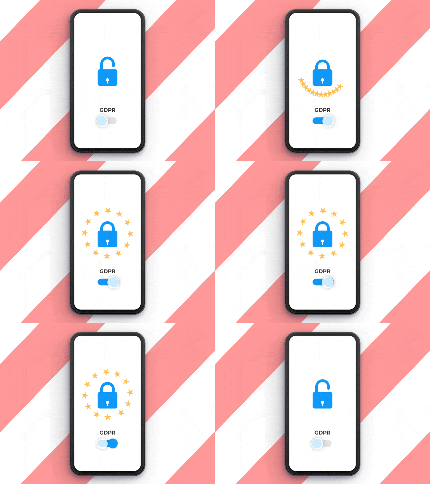
Privacy Policy is a kind of agreement between you and your users that ensures transparent relationships. For covering the international market, you need to comply with US law, UK law, Canadian law, and European law. It is your statutory duty to notify your users about what data you collect, how it can be shared, how it can be changed and what you will do with it.
To guarantee your contact form design is law-abiding, you can adopt one of these things:
- Add an “I Agree” checkbox that the user should tick to give their agreement.
- Add an Infobox where you state that by submitting the form, the user gives his or her agreement to your Terms and Conditions and Privacy Policy.
Both these methods should be supported by active links to the pages with Privacy Policy and Terms and Conditions.
Collection of Inspiring Web Form Examples
Contact Form by Vladimir Gruev
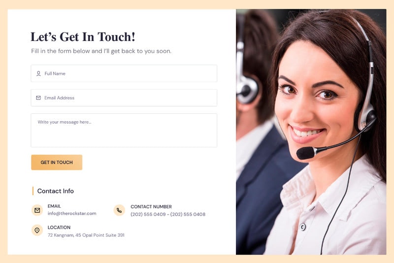
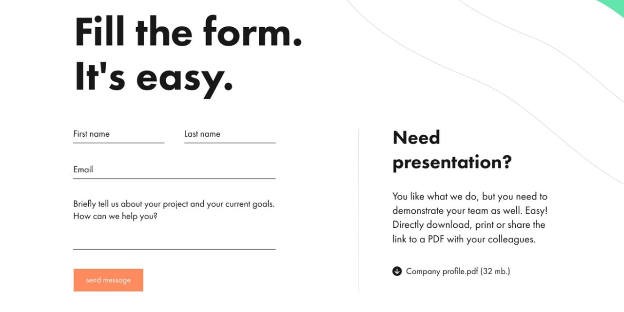
The concept by Vladimir Gruev is a typical contact form example that falls into the traditional category. You will see here four basic inputs, submit button, brief description, and title. Although it is highly recommended to use as few fields as possible and place everything into one column, however in this case, the solution works.
The deal is this web form design is highly popular among the companies. Users have seen it a million times, so they have got used to it. Therefore, it does not scare them away. The more so, all the fields are optional, and you should not share lots of personal information, so no strings attached.
The contact form example by Vladimir Gruev is trivial yet effective.
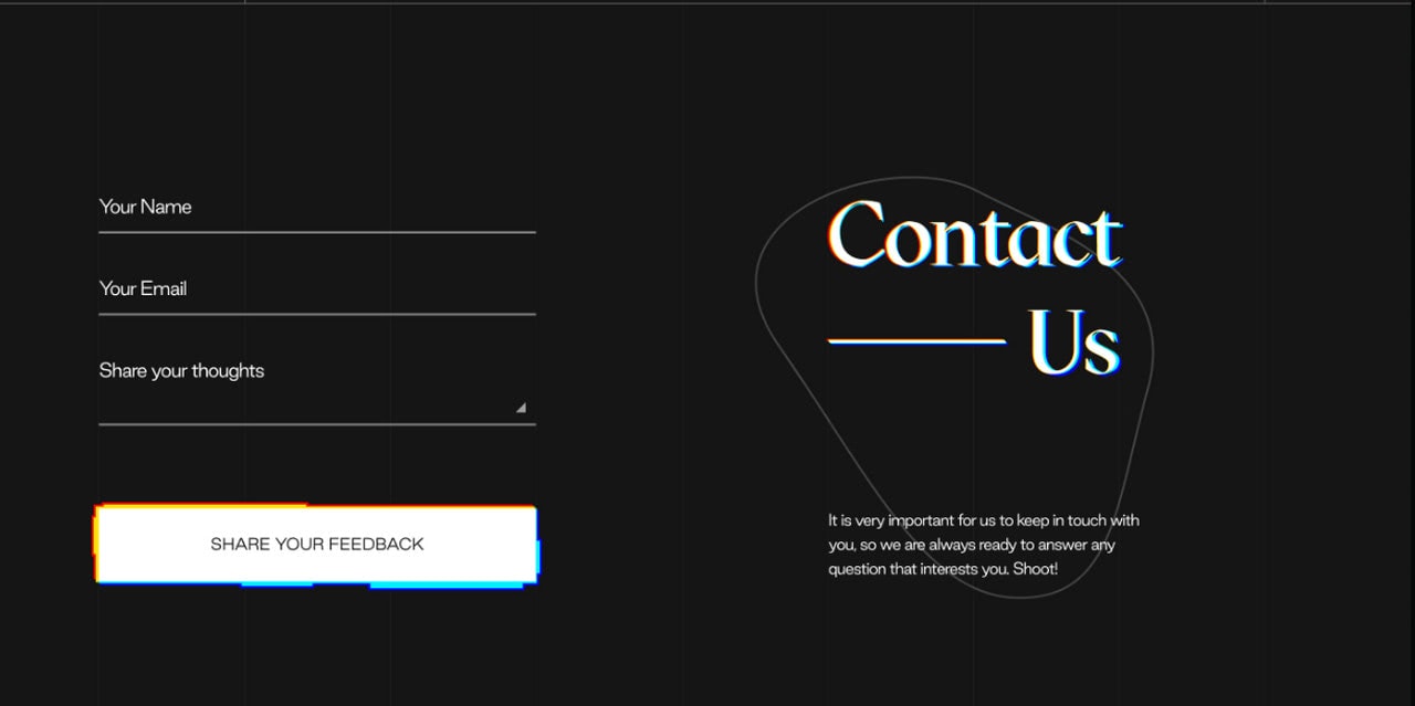
Contact Form Experimental Glitch Design by Danielix
Danielix has gone for the same approach; however, this time, he has added brand touch to the contact form design as well as played some modern tricks to make it stand out from the crowd. In addition, he has ditched the last name field since it is not essential for such cases.
Although the glitch-inspired solution seems a bit controversial, nevertheless, it is pleasant to an eye. The thing is the author has found the perfect balance between the idea and functionality: the design is fancy, but the process is straightforward. On top of that, opted in favor of traditional black and white coloring, he was managed to obtain optimal readability.
It is one of those web form examples that proves on practice that if you have an incredible idea, always try to make it meet the guidelines stated above, and it will certainly work.
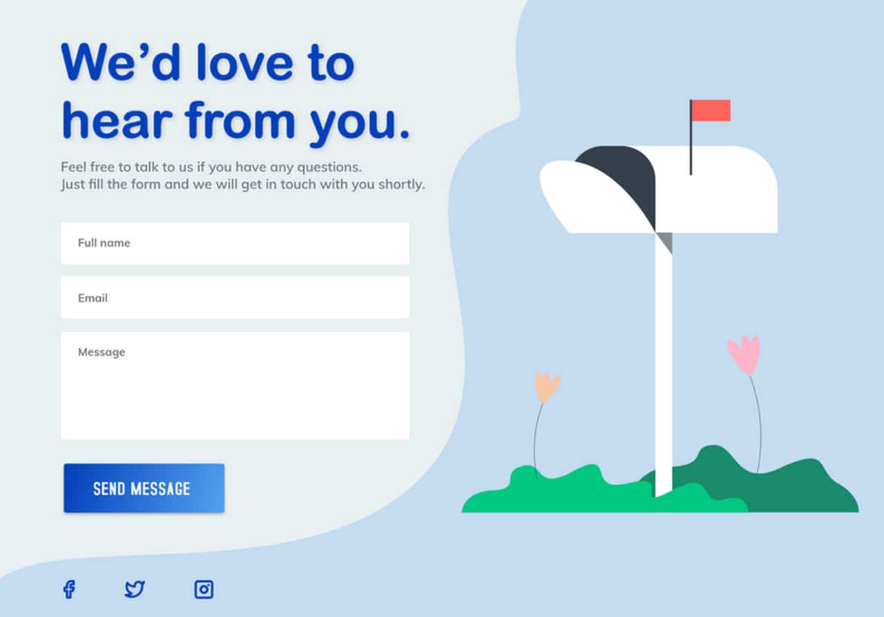
Contact Us by Loisyy Salvacion
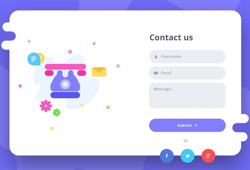
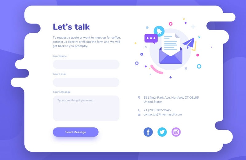
If the glitch effect is not your cup of tea, you can always adopt some time-proven ways of enriching web form designs like applying traditional illustrations. Loisyy Salvacion gives us a web form example.
Her contact form design is based on a classic one-column three-field layout allocated on the left. Beautiful drawing on the right supports the design visually as well as adds some playful touch that lightens the mood.
There is one small remark. It seems like the form needs a bit more contrast since, at some point, white fields blend into the light blue background.
As for the rest, everything is flawless.

Contact Form by Brandon Termini
Contact Form by Brandon Termini is one of the most oversimplified web form examples in our round-up. Its key feature lies in its simplicity and unobtrusiveness. All that it asks is an email address. Nevertheless, that is all you need since the rest of the personal information can be collected through the further correspondence.
One important thing to note. Brandon has added a progress bar for indicating the status and pleasant thank you message. These small details contribute to the user experience and leave favorable impression.
This compact solution proves the validity and effectiveness of one-field forms.
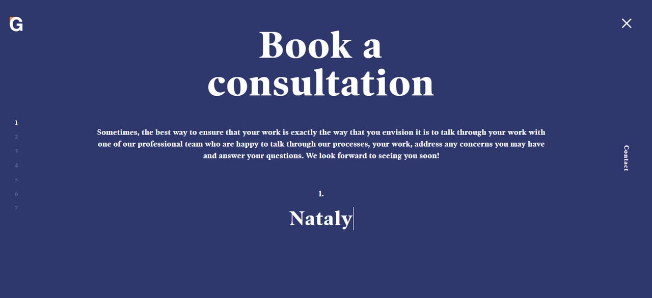
Book a Consultation Form in Genesisframing
Well, not all web form designs can be so oversimplified and concise. Sometimes you need to ask for more than just an email address. As we have mentioned in our guide, all such situations require multi-step wizards that will lessen the tension between user and interface.
There are various ways to bring this approach to life: you can use tabs, for instance. However, the team behind a book consultation form in Genesisframing has chosen a vertical slider. Here, each slide is dedicated to one question. You can move up and down since your progress is safe. That is certainly a creative solution to mundane problem.
This web form design works and rocks.

Multi-step wizards can be beneficial even for the simplest situations. Consider web form example in FlatStudio. The team was managed to unite three forms within one area.
Instead of exposing different forms, they have created a small two-step wizard that breaks the routine into digestible pieces. First, a user needs to choose a type of request by clicking on the link. After that, he or she should fill out a simple form.
Note, the micro-interactions there. The webform is pleasant and handy to use.
Conclusion
According to stats, onsite forms are the primary source of leads; therefore, whatever web form design you have, it requires your undivided attention. It should be flawless. You need to take care of not only its look and style but also performance, user experience, accessibility, spam, and legal issues. We hope our guide with tips and tricks, as well as the collection of contact form examples, will help you to improve your web form design to generate traffic and boost your revenue.
