Examples of Web Designs Featuring Big Website Menus
Navigation is a highly complex concept and of course, an integral component of every web project. Being some kind of a gateway into main sections, basically it is a list of links that is responsible for a comfortable and handy existence of your users on a website. It is able to pleasantly display the whole structure and information hierarchy without providing even tiny opportunity to get lost. Well-thought-out navigation is a first successful step to attracting and forcing to stay as many visitors as possible, so a great deal of developers starts their projects exactly with analyzing and building a decent navigation system.
In this article, we are going to talk about visual representation of navigation, it can be a simple lined up array of titles, huge drop-down menu, juicy icon menu, picturesque graphical menu, professional photo-based menu, and even plain circles, which quite often are used in parallax-based websites.
With Postcards you can create and edit email templates online without any coding skills! Includes more than 100 components to help you create custom emails templates faster than ever before. Try now for free!
Learn MoreOther ProductsThere are numerous approaches of showing it; however, nowadays designers resort to more colossal presentation that is aimed to instantly bring the eye to the menu. Today we are going to showcase creative ways of implementing huge navigations that are used not only for guiding visitors through inner pages but also for clearly demonstrating various categories mainly inherent to portfolio or gallery sections.
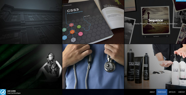
Ian Lunn has a topnotch website that welcomes users with a huge full screen navigation of its portfolio. The designer presents every its work with a help of image and a brief remark, effectively encouraging readers to take a closer look at items.
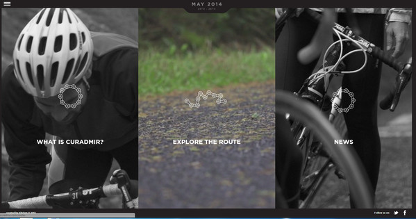
Curadmir – This sportive website is dedicated to popular cycling event in British Isles. It efficiently familiarizes visitors with the competition via three-sided photo-based menu that reveals main points. The designer wisely discolors all menu items except the selected one in order to clearly highlight it.
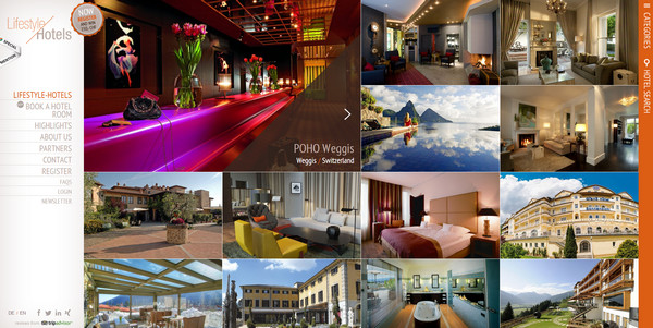
Lifestyle Hotels – The designer easily sets the mood and the tone of a hotel business on a website with a help of huge boxy menu. The designer makes use of a visual approach in order to present various hotels. Each menu item vividly showcases spectacular view or scene that can be found in these places.
With Slides, we don’t make you start from an empty slate. All you have to do is to pick the elements you like best and combine them. Each slide has been carefully crafted to satisfy three key criteria: aesthetic, function and usability. That way you know every element works together seamlessly while enhancing the impact of your content.
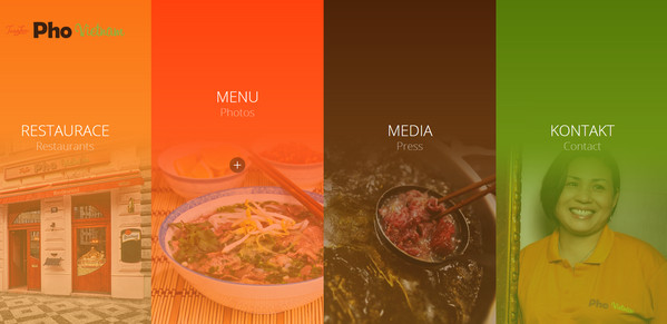
Create a WebsitePho Vietnam – The designer transforms the home page into a navigation system in order to make your online presence pleasant and handy. Thus you are able to quickly get the information relating to menu, restaurant placement, contacts and media.
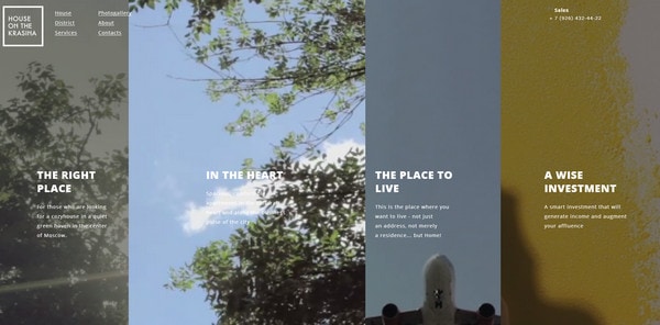
House on the Krasina is an interactive website that wisely takes into account the lack of people attention to small details by providing a huge attention-grabbing additional menu. Each menu item is an eye-catching cinemagraph work that is aimed to effectively support the headline.
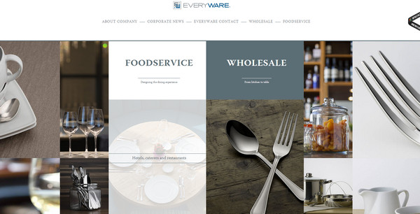
Everyware employs its welcome section as a huge navigation that accentuates various services. The photo-based menu is a centerpiece of the landing page that successfully conveys a right mood.
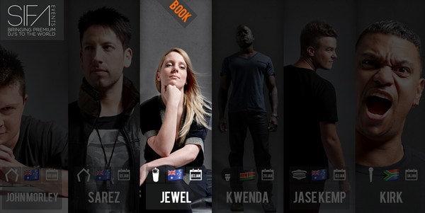
SIFA is a well-structured website dedicated to musical events. The designer skillfully presents all Djs on a single page, giving each one a relatively huge vertical stripe that includes not only an image of an artist but also a brief description.
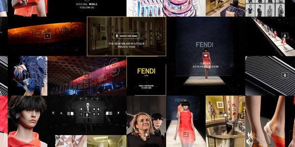
Fendi Life has a boxy, quite informative and truly advanced website design, which managed to quite unobtrusively demonstrate links to numerous key events.
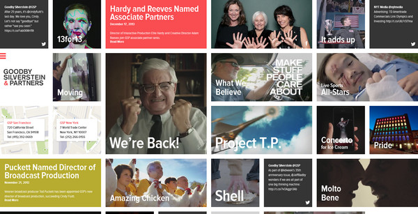
Goodby Silverstone and Partners – This first-rate ad agency tries to demonstrate its portfolio also with a help of huge navigation. The designer ably makes use of a grid-based layout in order to avoid information overload, clearly indicating and drawing attention to every portfolio piece.
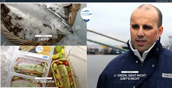
Deutschesee leverages a full screen photo-based interactive slider that plays a role of navigation. Every slide is neatly sliced into several key parts, where each part spiced up with a picturesque image that leads to its corresponding inner page.
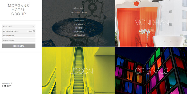
Morgans Hotel Group – This is another stylish and open website in our list that belongs to hotel industry. The designer capably showcases various types of hotels that are included in the group by means of a menu that takes up all the welcome section.
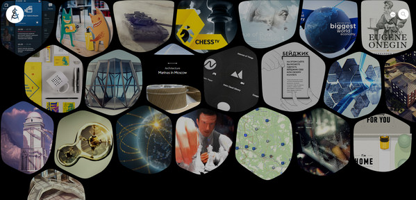
Altspace definitely breaks the mold of conventional design with its offbeat front page that is spiced up with an eye-popping lopsided feel. The home page is aimed to familiarize users with portfolio items that presented via smooth uneven shapes with nice dynamic effects.
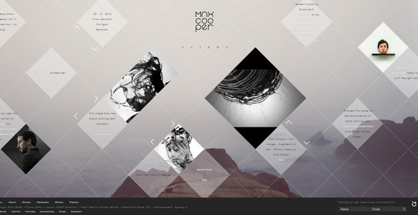
Max Cooper’s website has a neat diamond vibe. The front page looks sophisticated and at the same time, modest. It comprises lots of small sliders with data that help to navigate through inner pages.
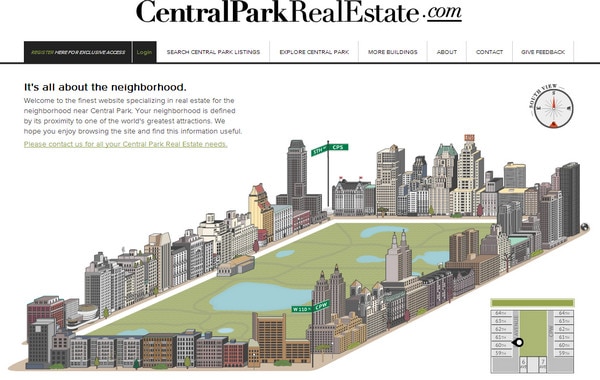
Central Park Real Estate – This simple website can boast about its intricate and truly complicated navigation that leans more toward graphical representation. The agency takes a rather creative approach of presenting various sales options.
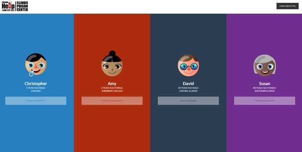
Poison Help is an informative, fully illustrated website that is intended to provide help in difficult situations. The home page is accurately divided into 4 even parts each of which leads to its own cautionary tale.
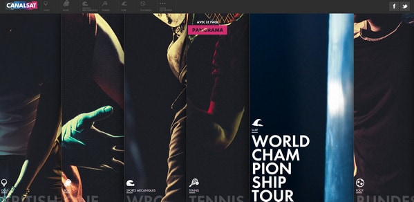
CanalSat – The French channel easily forces its user to dig into its sportive programs, drawing their attention via full screen interactive navigation system that leverages small cinemagraph sport-related excerpts.
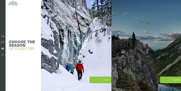
Travel Alberta – Much like the majority of presented above examples, this website also implements lots of spectacular photos in its design. The home page is neatly sliced into 2 huge sections dedicated to winter and summer trips.
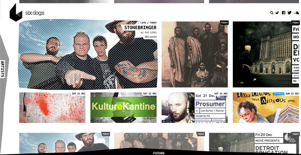
Six Dogs has a grid-based well-balanced home page where every cell includes a link to various musical events.
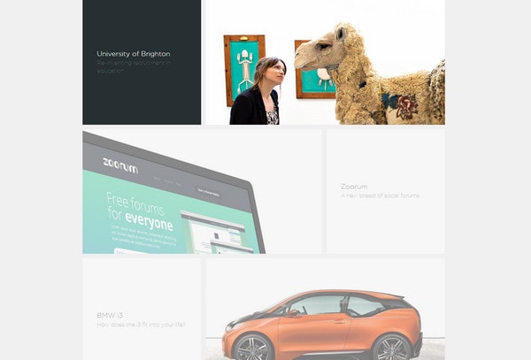
Magnetic Zero – The front page has a neatly-organized asymmetrical design that is aimed to focus users’ attention on a set of portfolio pieces. It has a clean appearance that allows visitors to effectively get acquainted with agency works.
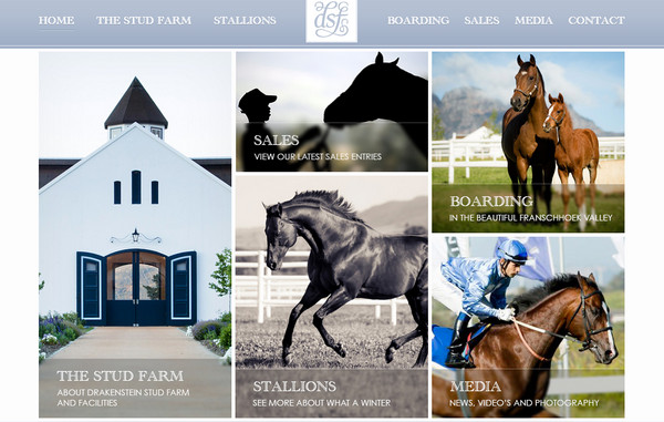
Drakenstein Stud relies on a minimal approach, concentrating visitors’ attention on relatively huge optional menu as well as conveying a sense of compositional harmony.
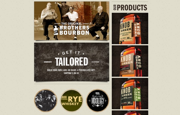
Knob Creek has a crisp vintage appearance. The main page enables you to easily navigate through products and various services via set of huge photo-based links.
Conclusion
Designers prefer to embed massive navigations – that, as a rule, leverage photos, videos or cinemagraph – into front pages or welcome sections in order to instantly get the visitors’ attention. This approach is applied not only to main menu but also to secondary ones that represent subcategories or standalone outer links.
What do you think about using huge navigation in web design? What advantages or disadvantages in your opinion this approach has?
