Less Text more Multimedia – New Approach in Website Design
Less text more multimedia, to be more specific using more videos in website design, is considered to be a new web design trend of 2014. Some hold to opinion that this is a quite controversial and bold statement, since content/text was always the king; others break this general consensus and adhere to the more progressive point of view, mainly relying on a power of human curiosity and love of getting information in a more fascinating way.
However, it is really hard not to notice that for the last few months, websites that incorporate lots of videos and drop text in favor of multimedia began to appear more and more frequently. Undoubtedly, such solution has its own pros and cons, and it’s certainly difficult to claim out that this is a truly rational and beneficial approach of making your website look modern, sophisticated and innovative. Nevertheless it certainly adds its own zest. Only time will show all the “pitfalls” and determine the positive outcome.
With Postcards you can create and edit email templates online without any coding skills! Includes more than 100 components to help you create custom emails templates faster than ever before. Try now for free!
Learn MoreOther ProductsWe have collected fresh examples of website designs that count more on visual impact produced by videos and images rather than on an informative side presented by regular text.
Examples of Website Designs with Video
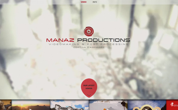
Manaz Productions – Much like the previous example, the website includes only visual data, there is almost no text. The choice of such solution is not surprising due to the fact that the website presents a video production company. Thus, the designer has populated the landing page only with videos that show off skills and experience of the agency.
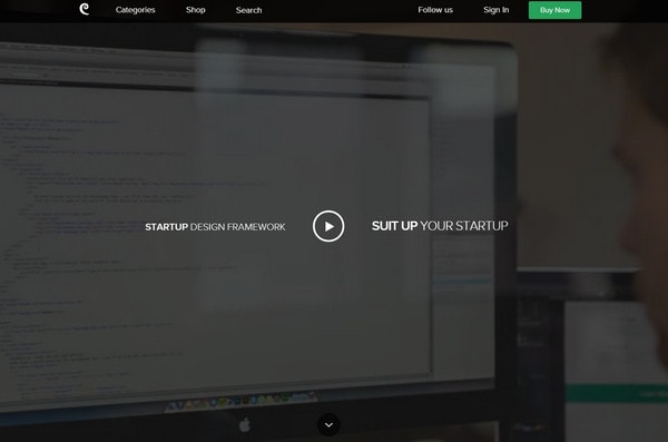
Startup Framework by Designmodo – The website, as well as the product to which it dedicated, exudes an image of professionalism and sophistication. The web page comprises lots of explanatory and descriptive visual data including videos and images that naturally speak louder than simple words.
The Barstow – The website is neatly sliced into 2 halves, each of which includes its own brutal video. These parts play a role of noteworthy navigation as well help to put users in an appropriate mood.
With Slides, we don’t make you start from an empty slate. All you have to do is to pick the elements you like best and combine them. Each slide has been carefully crafted to satisfy three key criteria: aesthetic, function and usability. That way you know every element works together seamlessly while enhancing the impact of your content.
Create a Website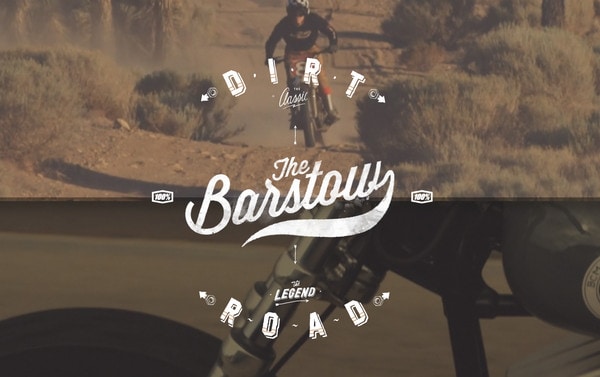
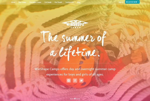
Winshape Camps has a fantastic, cheerful, full of joy website design. The home page includes a full screen video intro, and capably incorporates the same video as background – which is spiced up with a garish semi-transparent screen gradient – for functional sections.
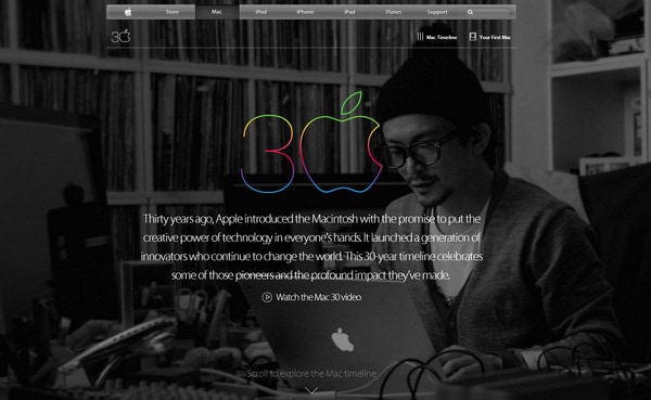
Apple 30 Years – The company has bestowed its loyal customers with a clean, modern and sophisticated website dedicated to its 30 years history. The page mainly comprises lots of interesting and enthralling videos that effectively reflects the essence.
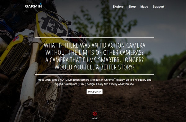
Garmin – This is a promotional website that skillfully showcases the advertised product in the best light. The website boasts of a perfect and truly winning combination of text and images that effectively support each other.
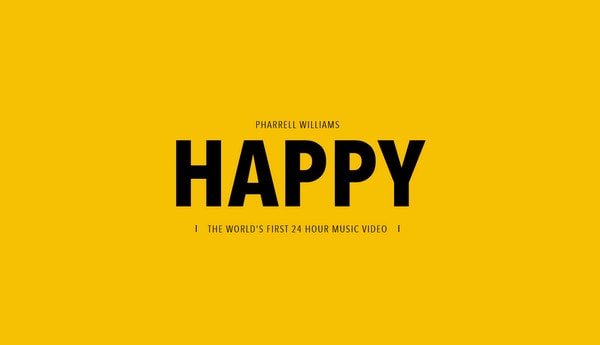
Happy – At first sight, this is a regular one page website that promotes the artist. However, it utilizes a quite innovative approach of drawing users’ attention by offering visitors to watch a 24 hours music-oriented highly spirited video that is aimed to demonstrate the whole power of the proposed products.
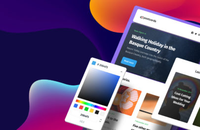
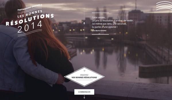
eCards Strasbourg – The website provides users with an opportunity to send unique e-cards. The lovely truly picturesque cinemagraph style background not only helps to emphasize the text but also actively encourages visitors to fill out the form.
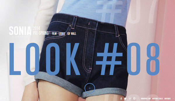
Sonia – As befits all fashion-focused websites, this one also utilizes a great deal of promotional material that represented by means of professional images, videos and even short films.
Joost Huver has a splendid and well-balanced website design that is chiefly populated with images. The designer skillfully puts the minimal approach into practice by creating a quite small yet truly informative one-page website.
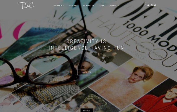
TSC – The website strongly relies on a great impact that is usually created by brilliant images. The team populates not only the home page but also other inner pages with numerous incredible pictures and shots.
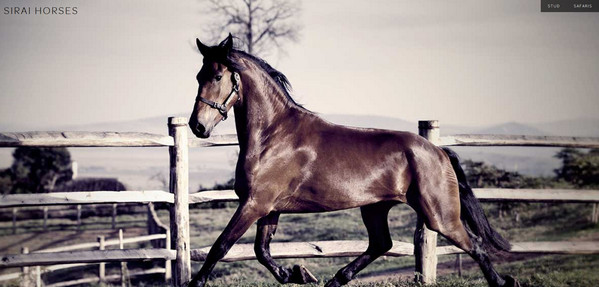
Sirai Horses – The website wisely makes use of gorgeous professional photo backgrounds that accompany all inner pages. They serve as main visual driving force that naturally fixes users’ eyes on pets.
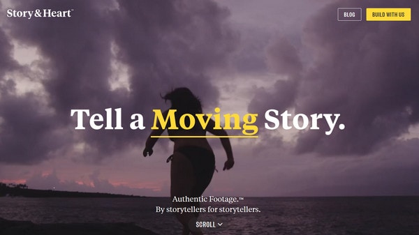
Story and Heart – The landing page of the website incorporates a startling video background that is able to effectively complement the content, and at the same time, grab visitors’ attention. Much like the example number 2, the choice of leveraging video as a backdrop is quite predictable, since the website presents a filmmaking community.
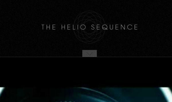
Helio Sequence – The designer ably employs a dark coloring that is famous for its ability to effectively give the significance to lighter elements. In this case, the dark clean background not only stresses the content but also helps the videos to stand out.
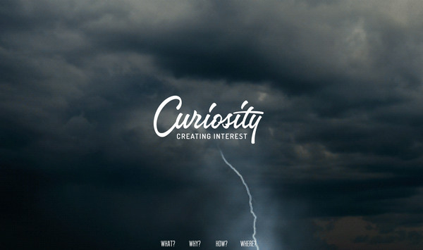
Curiosity Amsterdam – The welcome section comprises a set of short fabulous videos and remarkable images that mainly supports the tagline “Curiosity. Creating Interest”. The website definitely stirs up interest in regular users by means of its prevailing visual content.
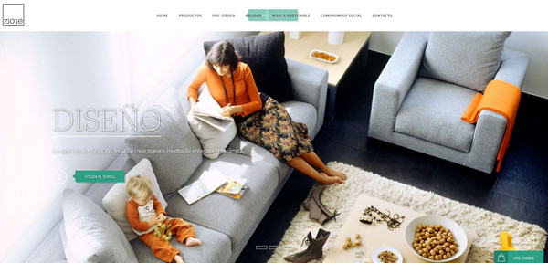
Zione Ceramica has a well-crafted photo-based long one page website that features a great deal of professional shots. The designer skillfully mixes lots of visual data, yet the interface stays well-structured and quickly scannable.
Kids Love Jetlag – The website is owned by a creative digital agency that employs a full screen slider with captivating and quite controversial videos.
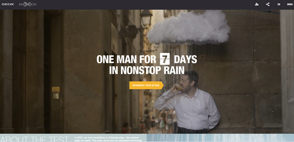
Geox is a flawless promotional website with a fresh and truly brilliant idea behind it. In order to demonstrate all the advantages of using Geox products, the company instead of listing benefits, have created an original video.
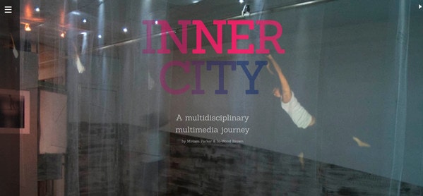
Inner City is another topnotch photo-based website design. The designer skillfully complements the regular content by means of fascinating spirited pictures.
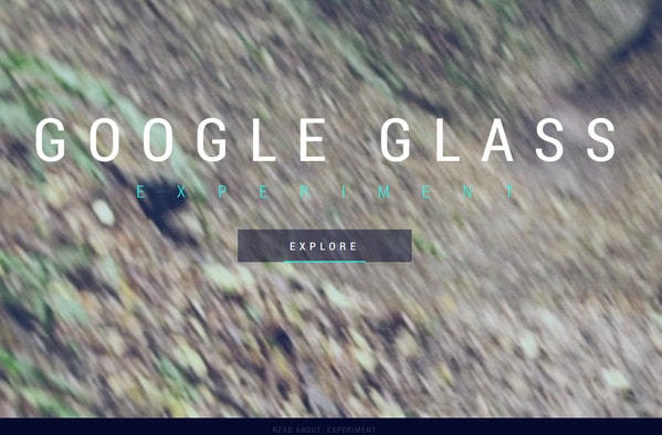
Google Glass Experiment has an interactive and advanced website that is filled with a dynamism and energy conveyed with a help of various videos. The latter serves as an excellent proof of huge possibilities hidden in a new product.
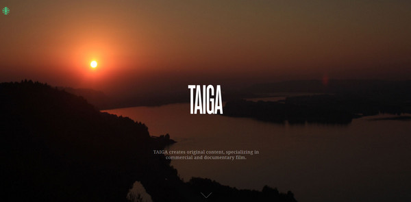
We are Taiga – The front page of the website includes only a set of several videos that take up the whole screen and are accompanied by brief descriptions. The agency mainly puts emphasis on their works, trying to avoid all the textual clutter.
Conclusion
The websites that give preferences to video-based solutions rather than time-proven habitual contextual layouts are quickly gaining popularity. And this approach is not only popular among creative agencies or video-related companies but also among regular designers and artists that simply adhere to the slogan “My work speaks for itself”
Do you think a fresh and trendy approach of “less text more multimedia” will conquer the web? What benefits does it bring? Share with us your thoughts.