Scroll Activated Animations – New Trend in Web Design
As befits each component piece of any website, an animation also undergoes changes and is subject to trends, even being a more complimentary and optional element.
Each year animation is gaining more influential and domination position; web developers carry out diverse experiments with it, starting from creating basic effects and ending up with pioneering ones. Without doubts, such an avalanche of projects that are driven by animations is caused by advances in web technologies and insatiable desire of web developers to take a website to the completely new level. Slowly but surely, the web is becoming definitely a more pleasant, sophisticated and dynamic place to visit
Online HTML Email Template BuilderWith Postcards you can create and edit email templates online without any coding skills! Includes more than 100 components to help you create custom emails templates faster than ever before. Try now for free!
Learn MoreOther Products
Though it sometimes goes almost unnoticed, so to speak without a proper “pageant”, yet we can still feel it. Thus, this year scroll activated animations along with lazy animations are going to pull the strings.
They bring their own touches and appeal to the website by providing simple users with a more smooth, careful and calm exploration. This approach, of course, is more typical for long one page websites that strive for giving their visual story a more dynamic and spirited appearance. However, this sphere is not its only manifestation; this effect is also applied to various corporate websites and online portfolios that as a rule are fully-illustrated. So in general, scroll activated animations can be deservedly called a new trend of 2014.
Let’s explore several impressive examples of website designs that skillfully make use of this popular and trendy solution.
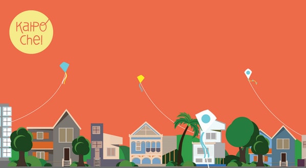
Kaipoche – The website is dedicated to kite festival that took place this year. It has a really vibrant and splashy design that is activated by means of a simple scrolling technique. Thus, thanks to lovely drawings that are supported by small animations the interface got a truly inviting and attention-grabbing appearance.
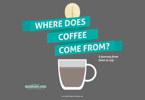
Bizbrain is an advanced long one page website that skillfully demonstrates statistical data via amazing colorful infographic. Each section includes its own piece of information that is wonderfully bolstered by activated animation.
With Slides, we don’t make you start from an empty slate. All you have to do is to pick the elements you like best and combine them. Each slide has been carefully crafted to satisfy three key criteria: aesthetic, function and usability. That way you know every element works together seamlessly while enhancing the impact of your content.
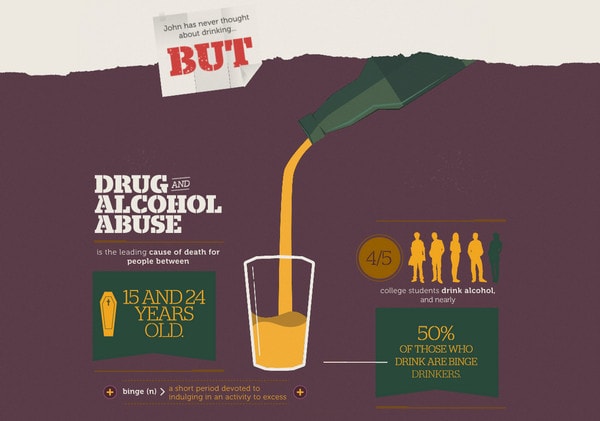
Create a WebsiteDrugs and Alcohol on Campus – Much like the previous example, this is also an interactive infographic that capably and unobtrusively raises awareness of quite urgent problems. Here, the scroll activated animations effectively contribute to the theme, making the issue look less gloomy and “dry”.
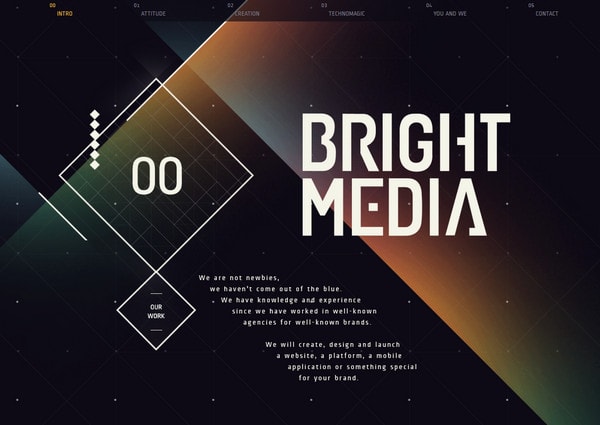
Bright Media – The team makes use of this trendy effect in order to visually unify all elements together. The technique effectively creates a visual track that leads users through intro’s sections, and is aimed to display data in the correct order. Moreover, each subpage includes small decorative elements that are nicely animated.
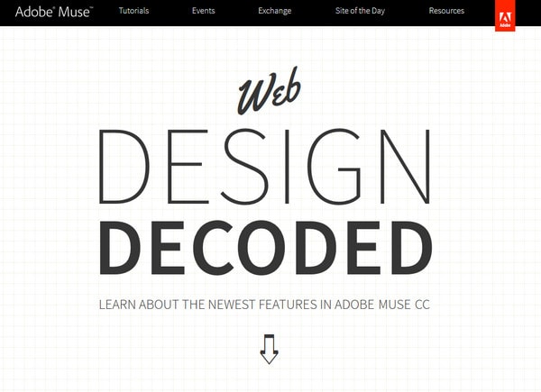
Adobe Muse CC has an innovative, clean and sophisticated website that leverages a beneficial artistic approach in order to bring more focus to its new product. The website mainly incorporates clean patterns and paper textured illustrations that come to life with a help of scrolling.
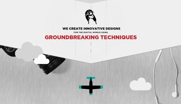
Fluger – The developer offers its visitors to explore the website together with a small airplane that you are able to set in motion via your mouse wheel. The website ably melds together photo-based elements and hand-drawn graphics where the latter is also revived during your journey.
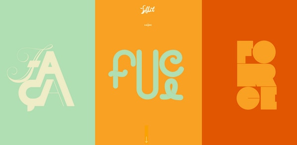
Fillet is a topnotch flat style website that features fantastic typography. While you are scrolling down every word is smoothly turned into another set of characters. Here, the effect is used to pleasantly and smoothly demonstrate transformation process.
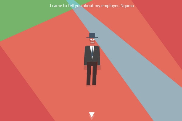
NGUMA is an interactive agency that charms with its dynamic and advanced website design. The website allows you to directly interact with its chief character. It is also based on auto scrolling that switches on animation on its own.
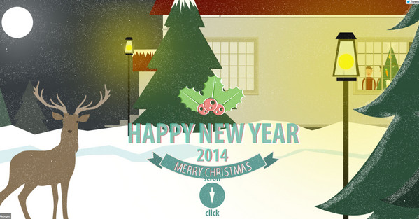
Happy New Year 2014 – Scroll activated animations are really popular among website designs dedicated to various feasts, especially Christmas. This website is no exception; you can freely explore a fully animated story that establishes a cozy festive atmosphere.
Merry Christmallax – Much like the previous example, this creative website is aimed to give its loyal customers and regular users a warm and hearty congratulation. The story begins with a clean sheet of paper and ends up with a vibrant fully-illustrated scene – the whole transformation is pulled by a scrolling technique.
Pixelgyar is another fantastic and engaging story dedicated to Xmas. The journey of the Santa Clause depends entirely on your actions, so spin the mouse wheel and let Father Frost reach its goal.
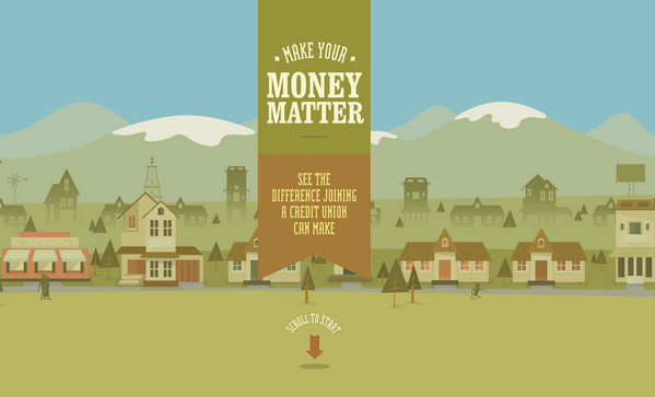
Make Your Money Matters – This is a promotional website that graphically showcases benefits of joining a credit union. You will become an active participant of its journey. The technique allows holding the theme alive and brings the better user experience.
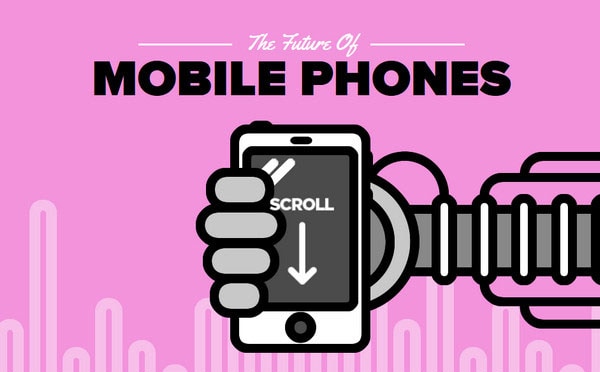
The Future of Mobile Phones – As the nameplate implies, the website is going to speculate about the future of mobile phones. As it’s expected, the website is a regular interactive infographic filled with statistics that are supported by subtle animated graphics.
Camplight is a neat, clean and stylish online portfolio that takes a fresh approach of interactive journey in order to closely familiarize users with the company.
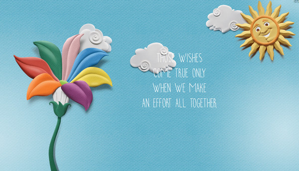
1McHappy Day – The website easily brings to users’ minds a happy carefree childish time thanks to its design that is constructed by means of plasticine like graphics, vibrant coloring and positive natural background. The whole scene is supplemented by a set of scroll activated animations.
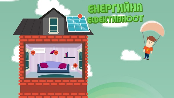
CEZ – The website presents another amazing interactive journey that is revived with a help of scrolling technique.
What’s behind the number? – The website is aimed to widely publicize about SPF Sunscreen and its advantages. While you are simply scrolling down, you are enjoying a whole vivacious story, which effectively tries to call you to safety under the sun.
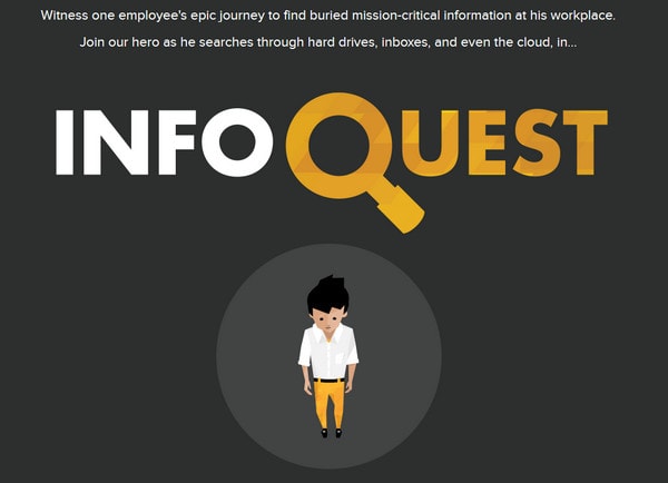
InfoGuest Infographic – As the nameplate implies, this is another infographic in our collection. As usual, it is populated with lots of informative content that effectively cooperates with animated graphics in order to achieve greater impact.
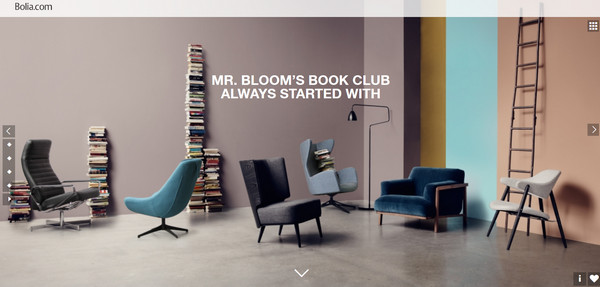
Bolia – Unlike the all presented examples above, this creative team applies scroll activated animations to photo-based layout, making different chairs to spin.
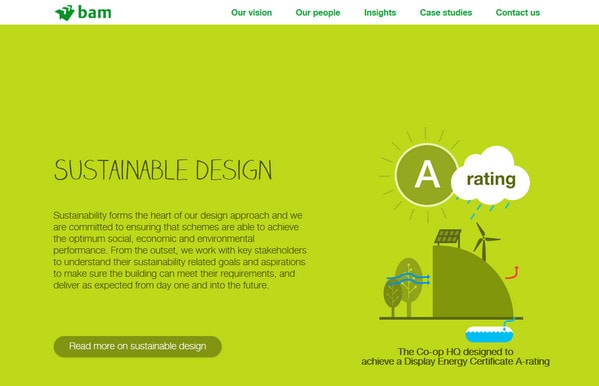
Bam – The company has decided to show its potential through basic approach of utilizing long page layout that is populated with content and complementary various drawings. However, in order to avoid feeling of commonness and plainness, the team employs scroll activated animations that bring a life to the website.
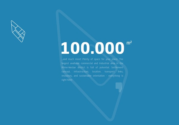
Areal Plankstadt – The website has a beautiful vibe of serenity that is achieved with a help of smooth shifting between pages, slowly activated animations and of course, calm coloring.
Conclusion
Our list comprises brilliant online infographics, visual storytelling websites, creative agencies and portfolios. All of them are managed to derive substantial benefits from scroll activated animations and produce a particular user experience that is full of pleasant dynamics.
Do you think this is a quite predictable trend? Will it stay for a long time? What benefits does it bring? Let us know in the comments.
