Interactivity, Dynamics, Animations: Fresh Examples of Non-Static Websites
Non-static websites is totally not a brand-new concept. At the beginning it was flash-powered websites that impressed us with its fantastic animations and astounding effects, and today they “have passed the baton” to the next more sophisticated and lightweight HTML5-based solutions that ably combine together CSS3 and jQuery possibilities.
Though there are still lots of problems with browser compatibility and displaying even basic CSS3 animations, modern web developers are accustomed to look a few steps ahead, anticipating the moment of resolving all the inconsistencies. And those of us, who constantly update our software, can already fully enjoy the whole power of new technologies and easily immerse yourself in the whole new world of spirited and complex website designs.
With Postcards you can create and edit email templates online without any coding skills! Includes more than 100 components to help you create custom emails templates faster than ever before. Try now for free!
Learn MoreOther ProductsToday we are going to take a look at various fresh websites that skillfully utilize non-static means by working into projects various basic and original effects, unorthodox animations and of course, interactive components that allow us to become an essential part of a performance. All such methods help to add to the website a feeling of positive dynamism and liveliness. The interactivity, dynamics and animations, even separately and even sparsely used, can create such a great impact on regular users that they definitely leave your website with a lasting favorable impression.
So it’s not surprising that nowadays almost every second website incorporates one of such approaches.
New Examples of Non-Static Websites
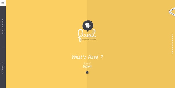
Fixed Agency – The developers’ team has done a great job of combining together illustrations and small yet subtle effects that skillfully revitalize every section. The website capably utilizes a vertical scrolling, elegant flat style and truly harmonious choice of colors.
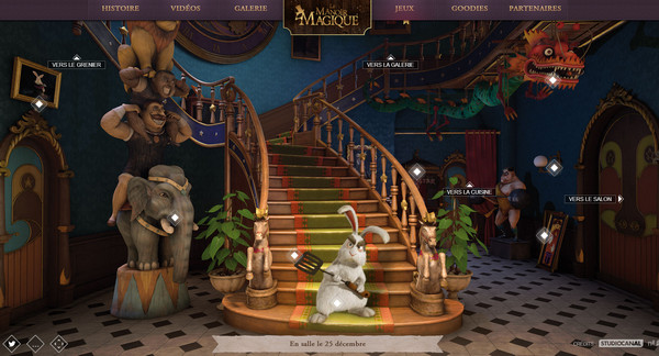
Le Manoir Magique is a fully interactive promotional website that effectively familiarizes users with a new film. You can watch various videos, examine scenes, animate characters and explore the website.
With Slides, we don’t make you start from an empty slate. All you have to do is to pick the elements you like best and combine them. Each slide has been carefully crafted to satisfy three key criteria: aesthetic, function and usability. That way you know every element works together seamlessly while enhancing the impact of your content.
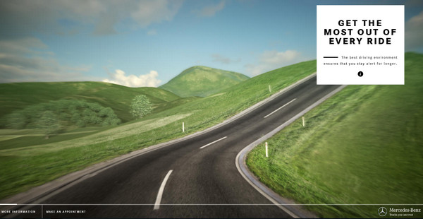
Create a WebsiteThe Perfect Kilometre is another fully interactive topnotch website that visually introduces Mercedes-Benz possibilities. You will explore various types of roads that can be smoothly overcome by any of advertised trucks.
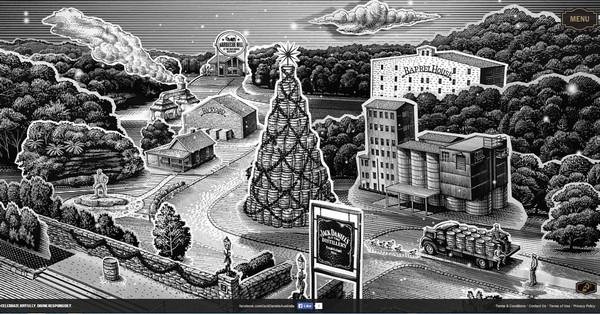
Jack Daniel’s Holiday Select – The website looks absolutely remarkable; the magnificent hand-drawn illustration on a front page that is equipped with nice effects is simply fascinating. The website is designed to acquaint online visitors with the factory.
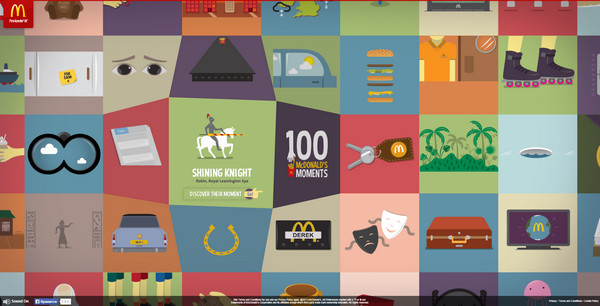
Favourites McDonalds – This is another promotional website dedicated to one of the most popular fast-food industry magnate. The developer is also managed to effectively unite illustrations and animations, adding to the landing page a lovely fluid effect with a 3-dimensional feeling.
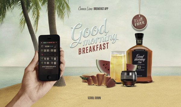
Good Morning has a wonderful retro vibe that is achieved by means of fantastic illustrations, bold typography and proper coloring. The developer leverages a new trend in web design – scroll activated animations – that laconically adds dynamics and vivacity.
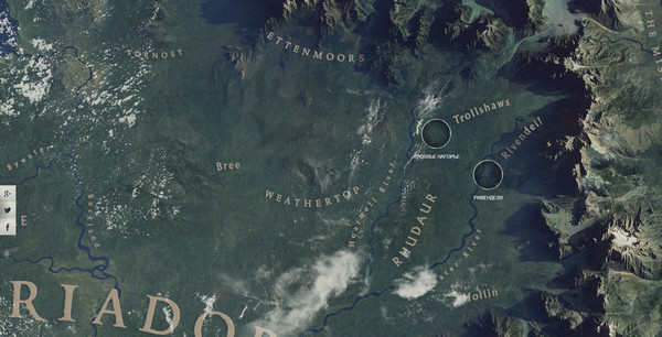
The Hobbit is a mind-blowing website that is intended to draw as much attention as possible to new series of “The Hobbit”. It is fully interactive website that allows you to freely explore the map of an unexpected journey.
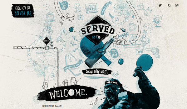
Served MCR breaks the monotony of regular designs by including numerous animated hand-drawn illustrations, original typography and muted coloring that all together gives the website its unique appearance. The website is so rich with details so that you just can’t leave it without a proper examination.
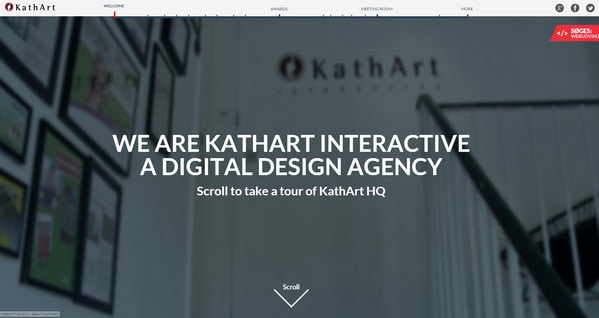
KathArt enables its users to virtually visit its office by providing them with a set of images that in tandem with regular scrolling effect skillfully recreate a sense of presence. This is a widely-used solution among creative agencies.
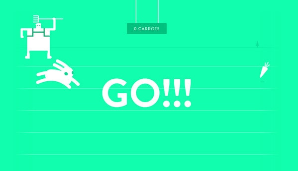
Hover Studio – Building a game-based HTML5-powered websites is quite popular nowadays so we couldn’t help to include it in our collection. The developer makes use of a simple 2-color scheme and plain flat illustrations that give the website a quite neat and clean appearance.
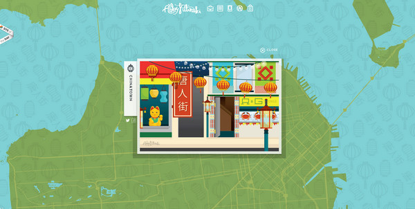
Abby Putinski presents a fantastic online portfolio that is full of remarkable illustrations. Each main section includes its own picturesque scene that is bolstered by tiny animations.
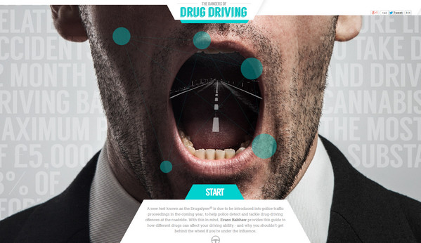
The Dangers of Drug Driving – The website proposes you to start your interactive journey that is aimed to clearly explain all the danger of drug driving.
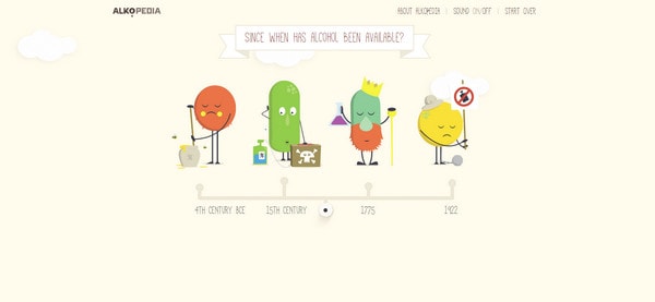
Alkopedia – The website speaks completely through cartoonish illustrations and characters that are enlivened with a help of small animations. Such approach is managed to establish a quite positive atmosphere and focus attention on a history of alcohol.
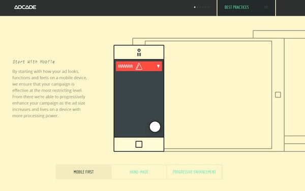
Adcade is a regular online portfolio that clearly presents agency. The developers’ team has equipped every subpage with animation that effectively demonstrates its content. On the whole the website looks accurate and clean.
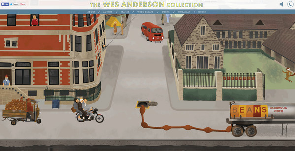
Abrams Books has a brisk fully illustrated website that includes a marvelous urban scene that is spiced up with animated personages and elements. The developer rather skillfully expresses movements and vivacity on the street.
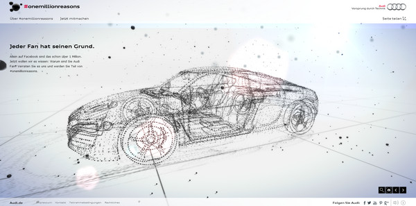
Audi One Million Reasons – The website is intended to let you explore a car in 3-dimensional format. You can easily take a look around or even glance inside. The fresh approach of molecular presentation is simply amazing.
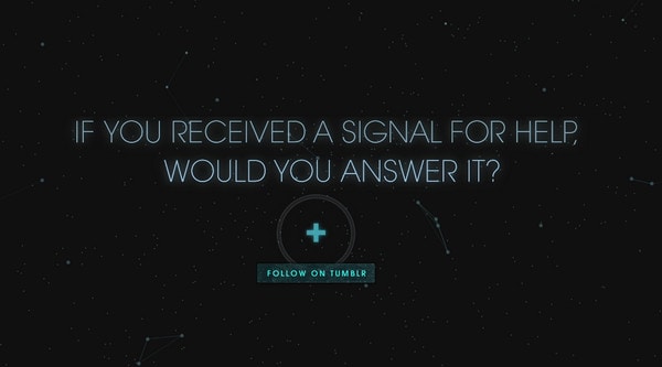
Call Him Echo is a first-rate fully interactive website that simply captivates. The website skillfully combines interactive components and various small videos that effectively support the concept.
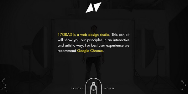
17 grad – The team has ably adopted an approach of scroll activated animations and content. While you are scrolling down, the website reveals all main aspects, demonstrating online portfolio of the agency.
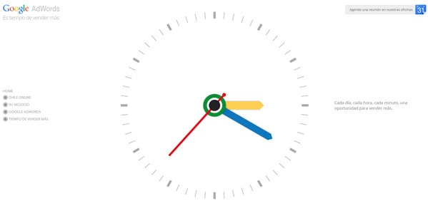
Google Adwords – Google is famous for its innovative websites and ingenious solutions, so that its new website dedicated to Adwords is also full of dynamic appeal and interactive elements.
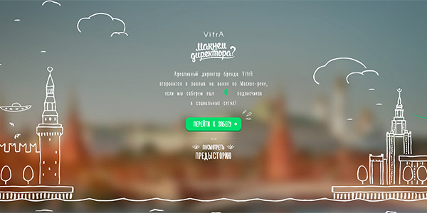
Vitra – Once we had sent one pesky boss to the mountain peak, it’s time to set out the other one on a voyage. The team has quite creatively solved this issue by building a classy sketchy attention-grabbing design that is supported by various small stunning animations.
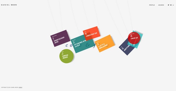
Daniel Moon has a spectacular online portfolio that welcomes readers with a regular slightly animated menu. The website includes various small effects and animations that enhance a visual experience.
Conclusion
Undoubtedly, adding interactivity or animations to your website is a one step forward to more advanced and sophisticated web. Dynamic websites always draw more attention than static ones, however it is quite imperative to evaluate all the pros and cons while you are building such a project, since sometimes all your efforts may be crowned with ashes only because user’s browser simply doesn’t support such effect; and in this case, your extraordinary full of incredible animations website will turn into a “death screen”.
Do you know any other impressive examples? Share with us your thoughts about interactive websites. Do you like it or not? Why?
