Useful Typography Tutorials to Enhance your Skills
Typography is one of the most important elements of a design, if not the most important. Content can be put in focus by many elements or design laws, but if it is not readable, there is no way users will engage in reading it. In our era filled with distractions only one click away, users need to make an effort to stay focused on reading something, especially if it’s a long set of paragraphs. And while the content is actually the most important, the way it’s laid out comes right after.
You can have the most interesting copy text in the world. Not being able to make it readable will hurt you. You can see how good the typography is on content websites such as Digg and Medium. Big type, increased line height, color contrast and spacing are elements that are very important and, if you are interested in improving your typography skills, you arrived at the right place.
With Postcards you can create and edit email templates online without any coding skills! Includes more than 100 components to help you create custom emails templates faster than ever before. Try now for free!
Learn MoreOther ProductsThere are many tutorials on the web on how to become better at typography, but not all of them are of high quality. Therefore I thought of gathering many tutorials that I could, that I believe create value and offer you something more than just a trick. Learning typography is important and your journey starts here, today.
Learn the Basics of Typography
Understand the language of letters
Sometimes the toughest part of getting started with a first design project can be understanding the language of design. Typographers, for example, have a whole language of their own that relates to type, fonts and design.
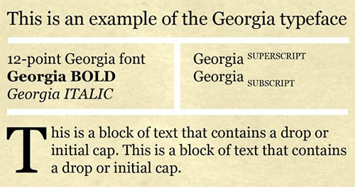
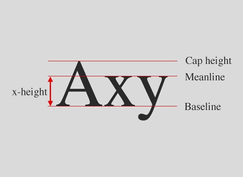
Crash course in typography
Although the tutorial is soon three years old, it seems that it never gets old. The information you can find in this crash course is amazing and this is because the article has been written by somebody with a deep understanding of typography. You will learn here about what’s a serif, a sans serif, the mood of fonts and really basic concepts of typography, so this tutorial is really the best place to start if you have absolutely no knowledge of typography.
Paragraphs and special characters
With Slides, we don’t make you start from an empty slate. All you have to do is to pick the elements you like best and combine them. Each slide has been carefully crafted to satisfy three key criteria: aesthetic, function and usability. That way you know every element works together seamlessly while enhancing the impact of your content.
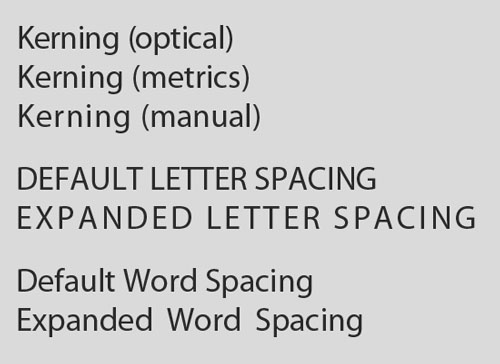
Create a WebsiteYou can learn about ligatures, smart quotes, ampersands and other special characters from this tutorial. All these elements are important and you will, sooner or later, need them. Here you can learn about word and character spacing and how important it is to space the elements of a font right.
Combining typefaces
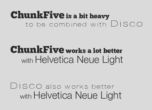
Now learning about typography is one thing, but learning about how to combine fonts, which is something many designers do, is a total different job. Making fonts work with each other is not as easy as it sounds, but it can be done in a quite marvelous way if you learn principles behind the technique. This tutorial will be right for you if this is what you want to learn.
Making use of grids
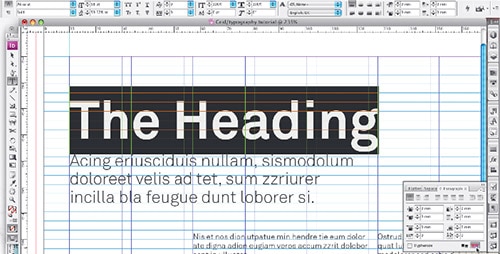
In order to give copy text a great foundation and to keep text-heavy websites organized and clean, you might want to learn how to place text on grids. Consistency is a principle that is difficult to achieve if you don’t know much about typography, but you can learn everything about it from here. You will learn how to make use of InDesign to build templates on which paragraphs of text will be laid out in an organized manner.
Guide to Web Typography
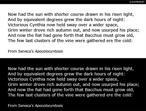
Learning how to use typography for a poster or any graphic purpose is one thing, but learning to create great typography for web is another thing. If you are a web designer who needs to learn about using typography on websites, this tutorial is the one which will educate you entirely. You will learn about size, contrast, hierarchy, spacing and others, while also looking at some practical examples of good and bad web typography.
Typography in mobile design
What makes mobile typography special is the restrictive nature of mobile screens; they are small and used in brightly lit areas so that it is difficult to see anything. Therefore, when it comes to typography for mobile devices you have to be very careful about how you go about it.
Typography for responsive web design
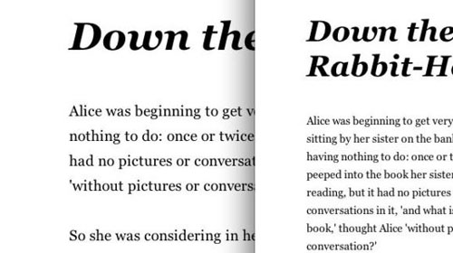
Responsive web design is one of the most popular trends on the web and has been for quite some years now. But handling typography for responsive layouts is not a piece of cake and it actually requires much more attention than a normal website. You will also need to learn about this, so the tutorial presented above is the perfect one for this purpose. You need to know basic HTML and CSS and be familiar with typography and the tutorial is based on a project, so you will learn the practice part of it as well, not only theory.
Learn Fun Skills
Now that you have the basics of typography (hopefully you do by now), you can get to more fun stuff. I’ve learned Photoshop actually by doing lots and lots of tutorials that I found on the web, so maybe you can learn typography by working with fun tutorials. Don’t forget, practice makes perfect.
Creating an elegant headline
Headlines are useful in both websites and printed materials and learning how to create them properly is key to attracting the eyes of visitors. Learn to create an elegant headline by following this tutorial.
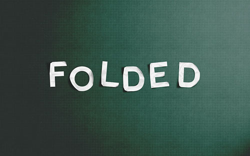
Folded paper text
Creating a realistic folded paper text in Photoshop might not be as easy as you think it is, but if you watch this tutorial, you will definitely learn how to do this quickly and effectively. The effect is great and this might come in handy when you need to create something like that for a poster or a magazine you work at.
Retro Typography Poster
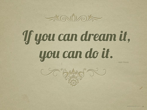
There are many tutorials on how to create retro typography posters, but I believe this one is the most exciting I could get my hands on. The fact that all the steps are shown with images is great and will help you follow the process better and quicker. The results will probably be amazing, so don’t forget to give me a buzz on how it ends.
Typographic concept poster
As you can see in the image below, the final results of this tutorial will be great if you follow the process step by step. The good part about this tutorial is that a video has been created to accompany image and text, so you will be able to get through the learning process much quicker than with a traditional tutorial.
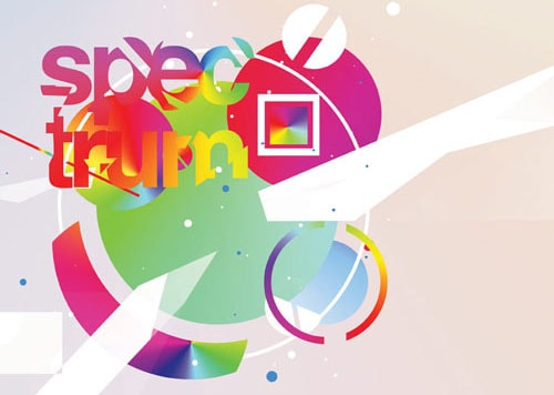
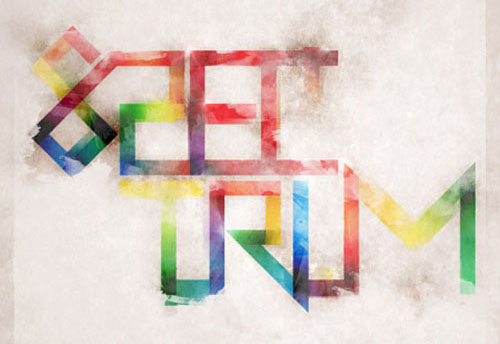
Creating a spectrum poster
I am usually in love with tutorials like this one because the results are great to look at. This tutorial makes no exception and I believe that working with this will definitely improve your typography skills. Go and give it a try!
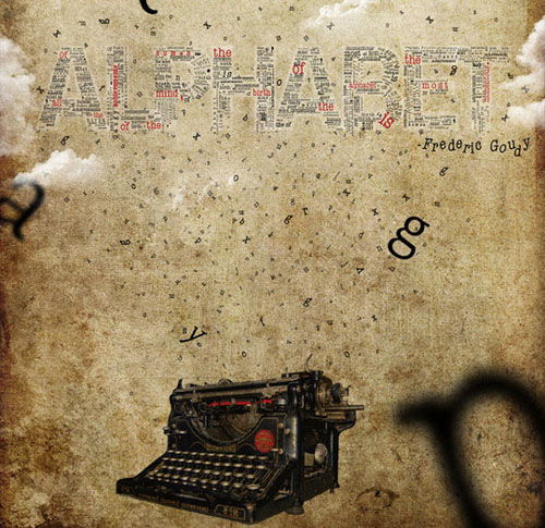
Classic serif poster
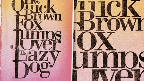
This tutorial will help you create a classic serif poster, something that stands out and will make your audience take notice. The results will be incredible if you are able to follow the tutorial step by step, but try to do something different too, if you have a good idea – it would be great to innovate even more, and create something that nobody thought of before.
Inspiring artistic poster
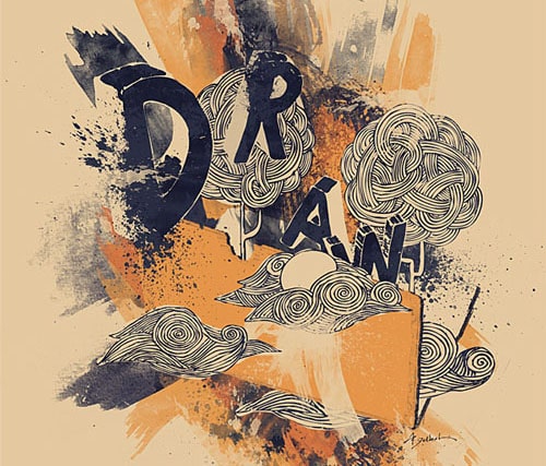
This tutorial is also great and if you follow it, you can learn to make an amazing and inspiring artistic poster filled with drawn elements. The elements will be created using design brushes – they will all be merged into this poster which will have a hand-made, personalized feel and will look like an original artistic illustration.
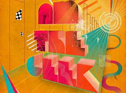
Vector Typography Poster
This poster is also a great creation and can be done in both Photoshop and Illustrator, so it is entirely up to you. The text will look distressed and is inspired from the 80’s, with an abstract type, mixed with a full spectrum of colors and then grunged up with textures and background tones. The theme of the poster is both classic and modern and the effect it creates is great.
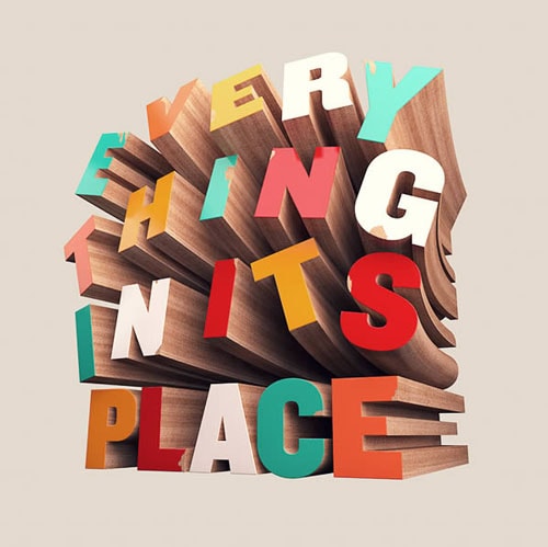
Create wooden 3D text
You will be able to create the effect in the image below by using Photoshop and Cinema 4D if you decide to try this tutorial. You will need to download some assets in order to be able to create the same effect, but they are free to download and easy to use. You will have to get Cinema 4D as well, but this shouldn’t be a problem either, as you can probably only get a demo of it. The effect is amazing and I think that it is worth getting Cinema 4D if you want to achieve it.
This was it for today, don’t forget that if you have none or limited knowledge of basic typography, you need to start with the first tutorials and build up on your knowledge from there in order to create the fun stuff.
Mastering typography is something critical if you are a graphic designer or web designer, because whatever we do, content is always the most important. Learning how to put content in focus is a great skills that many crave to have, but not all are willing to spend the time to learn it. This is where you have to make a difference; go through all these tutorials, get good at typography and amaze everybody with your skills – you’ll see, it’s much easier than it sounds.
